Jane Doe Spatial Stats 3650 2001 DU
Lab Exercise #2: Correlation, Regression and Modeling of
Population and Population Density with nighttime imagery provided by the DMSP
OLS satellite.
In this lab you will perform
analyses and use data associated with my dissertation: Census From Heaven: estimation of human population parameters using
Nighttime Satellite Imagery. The datasets are of the world,
Outline
of your tasks/objectives
First you will look at the
global datasets are try to build a model that estimates the population of the
cities based only on manipulations of the nighttime image. Then you will try to
improve that model by incorporating aggregate national statistics.
Second you will apply a
similar model to the
Thirdly you will look at
the concept of ‘ambient’ population density in the
Finally you will select
some city in the U.S., build a population density model for it using the
nighttime imagery, map the residuals in your model and produce a publication
quality one-page figure characterizing the model and its performance for you
particular city.
Analysis of World data
Task #1: Using Arc/INFO and/or ArcView
create a polygon coverage that has every contiguous blob of light in the
nighttime image (to do this you will need to create a binary grid from the ‘earthatnight’ grid using the CON function in grid). Next
you will have to do a REGIONGROUP command in grid. Next a GRIDPOLY command so
you have a coverage of polygons that represent all the
urban clusters in the world as identified by the nighttime imagery. Each of
these polygons has a unique ID.
Task
#2:
You will need polygon coverage to have the following attributes: AREA,
COUNTRY (preferably a FIPS code), GDP/Capita of Country, # of cities with known
population that fall inside polygon, the names of these cities as one long
string, and the sum of the population of these cities. (sometimes
due to conurbation more than one city falls into these polygons
)
DFW
Task
#3: Output this table into a txt or dbf
file that can be read into MS Excel. Export it from Excel as a tab delimited
text file and read into the JMP statstics package.
Answer the
following questions:
1)
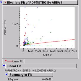 Run a simple linear regression between area and total
population in the table. Describe the results and problems:
This illustration of the best fit line is not very good with a
r2 of .026. With 743 records it is highly likely that any best fit
would be significant even though it may not be representative. In this case the
few outliers (big cities) are influencing the relationship while the large
majority of records are globbed up near the lower
limit of the range.
2)
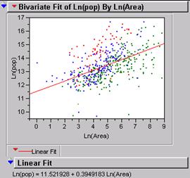 Transform your area and total population values to Ln(Area)
and Ln(total population) and run the regression
again. Describe the results and problems.
Taking the log of both variables spreads the data over an area that can be more
accurately analyzed for their relationship. The r2 is up to .36 and
even though that is not great it is a big improvement.
Ln(pop) = 11.52 + .3949 * ln(area)
3)
Color code your points so that points
representing cities in countries with a GDP/capita less than $1,000 / year are
red, $1,001-$5,000/year are blue, and over $5,000/year are green. Run the same
regression on Ln(area) vs. Ln(total
Population). Describe the results.
The high income group has a lower intercept and a more level slope.
Ln(pop)
= 10.70 + .475 * ln(area). r2 = .44
The middle income group has a higher intercept and a
similar slope.
Ln(pop)
= 11.09 + .519 * ln(area). r2 = .38
The low income group has a similar intercept and a
steeper slope.
Ln(pop)
= 11.67 + .623 * ln(area). r2 = .32
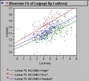
This indicates that as a city gets bigger the number
of wealthy people increases at a lower rate than the number of people with very
little money. LDCs may be under-estimated.
4)
Create a new column in
JMP called IncomeClass or something based on the red,
blue, green code above. Run separate regressions on ln(area) vs. Ln(total population) for each class. How do these
regressions on subsets of the data compare to the regression on all the data.
Describe and explain the difference.
See above explanation.
5) Assume you only had the regression knowledge from the
previous exercises and you had to estimate the populations of Mumbai (
You would insert the area in the equation to solve it for population.
Ln(pop)
= 11.52 + .3949 * ln(area)
Est = 1,658,791 Actual = 7,015,781
Est = 770,479 Actual
= 1,832,321
Mumbai: ln(pop)
= 6.0331 So, 11.52 + .3949(6.0331)
Est = 1,093,074 Actual = 14,482,636

To find the 95%
confidence interval for these estimates you must multiply the standard error of
the intercept by the z-score of alpha = .05% which is 1.96. or
read same off jump printout. To get the upper limit you add this number to the
variable in the equation and to get the lower limit you subtract it. Do the
same for the slope. Do both upper and lower limit for each of the three cities.
See table above.
The
6) How could you use these regression models, a nighttime image of the world, and a % urban figure for every nation of the world to estimate the total global population? From the nighttime image you can identify all the urban centers in a country. From the regression equation (using the log of area and log of population) you can determine parameters and make an estimate for each of the urban centers. The sum of those population centers is the total urban population of a country. Once you know the % urban then you can calculate the total population of each country. For example, if the sum of urban residents is 4million and the per cent of the total population that is urban equals 80%, then the total population of the country is 5 million people. ‘Lather Rinse Repeat’ for every country to get the global population.
Analysis
of
Task #1: Generate a table similar to
the one you did for the world using the population density and nighttime
imagery grids for the
7) Produce a histogram of the population density data.
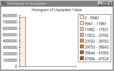
8) Produce a histogram of the usatnight
data.
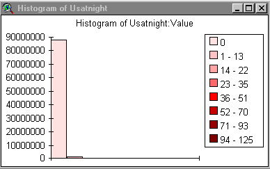
9) By looking at these histograms comment on the likelihood that a model derived from nighttime light emissions could predict population density.
The histograms look similar so you would think that it might work pretty well.
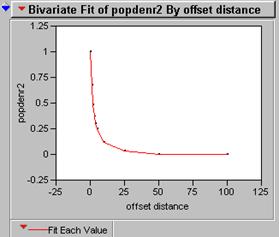
10) Produce a correlogram of the pop density data (use the CORRELATION function several times)
11) Produce a correlogram of the usatnight data
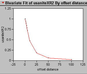
12) What does the correlogram of the popdensity data suggest about the effectiveness of a perfect model if it is mis-registered by one pixel?
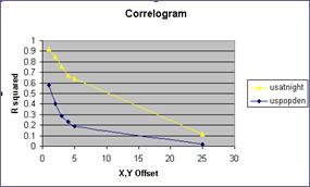
The first pixel costs the greatest amount of correlation. The second one is worse but not twice as bad. How can this be, when we know that the greatest chance of two things being exactly alike is related to their proximity? The answer is that autocorrelation causes an inflated r2 inside the lag zone. The correlogram indicates by the steepness of the curve something about the randomness of the data and the edginess of the clusters.
If you think about the correlation of the binary mask image then you can imagine that the cluster of 1slands mostly on 1s when the shift is just one pixel. In fact only the edges of the cluster will be landing on the 0s that are outside the cluster. Big solid clusters will have flat smooth correlograms while tiny clusters that have more edges than central pixels will have sharp steep correlograms.
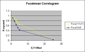 13)
Run a FOCALMEAN on the pop density data? (use a 5x5
and an 11 x 11 filter). Now generate two new correlograms
for the ‘smoothed’ data. How does FOCALMEAN work, and how does it change the
data?
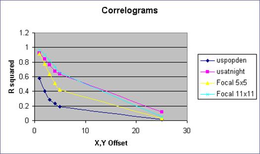 The focalmean
works like a convolution window where the average of the nearest neighbors is
placed in the center square for each cell in the data set. This
function smoothes the data. The bigger the window, the
smoother the data. The correlograms are not as
steep after the data has been smoothed.
Smoothing the data from the popdensity brings the correlogram into line with the usatnight. Once the data has been normalized in this way the regression equation should be more accurate.
14 )
Perform the same Ln(area) vs. Ln(Population)
regression on this data.
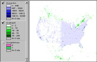
Where is smoothed data grid from focalmean and where does us binary grid fit into the discussion.?
World : r2 = .261
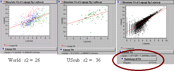
How is it different than the results for the
 The
big increase in the r2 for US data is due the fabulous quality of the
15) Use the CORRELATION command in grid to get a simple
correlation coefficient between the
16)
We have identified several other factors that account for errors in these models. A weighted multivariate relationship probably exists in which several elements of the landscape are working together to determine the actual population of a city. High density is not a random act of God. People choose to live close together (or far apart) for reasons that are emotional, practical, economical, political, physical or any combination of those factors. Then they put up lights to indicate where they spend the most time at night, which is not necessarily where they live.
Analysis of the
Characterize ‘ambient’ population density as a temporally averaged measure of population density that accounts for human mobility, employment, entertainment, etc.
17) Apply your model of population
density prediction from before to the
a) What is the correlation of your model to residence based pop den?
R = .46
b)
What is the correlation
of your model to employment based pop den?
R = .35
c)
What is the correlation
of your model to the average of these two?
R = .56
18) What do your results above suggest regarding your model’s ability to predict ‘ambient’ population density? Taking the average of the pop density and the job density give a better picture of where people are, so the lights seem to indicate a stronger relationship with where people are than they do with where people sleep.
19)
Visualization of Error: Subtract your model from each of the following:
Residence-based pop den, Employment based pop den, and average of Residence and
employment based pop den. Which errors look most random? Which ‘map of
residuals’ has the smallest mean absolute deviation?
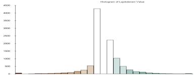
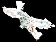
These histograms of the error between the model and the three data sets that were used to create the model show that the estimate works pretty well for the ambient population. Night lights (rad cal) is a good indicator of where people are at night, if you do not assume that they are all at home.
LAjoberror

LApoperror

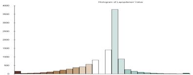
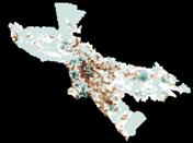
LA error

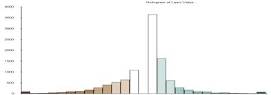
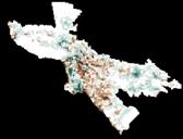
Some interesting things about the residual maps and their histograms. The mean of the error is not always the value 0. Green indicates the places where the estimate is too high, while the brown show where the estimate is too low. The size of the standard deviation used for the classification of course is based on the range of values and the variance so it is also different for each map.
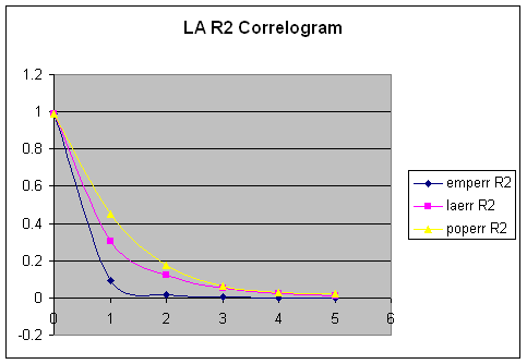
Produce correlograms for each of
these residual maps. What do these correlograms
suggest about these three images?
Offset |
emperr |
laerr |
poperr |
emperr
R2 |
laerr
R2 |
poperr
R2 |
|
1 |
0.304 |
0.5514 |
0.6731 |
0.092416 |
0.30404196 |
0.45306361 |
|
2 |
0.1369 |
0.3509 |
0.4176 |
0.01874161 |
0.12313081 |
0.17438976 |
|
3 |
0.0791 |
0.2283 |
0.2525 |
0.00625681 |
0.05212089 |
0.06375625 |
|
4 |
0.0053 |
0.1445 |
0.1764 |
0.00002809 |
0.02088025 |
0.03111696 |
|
5 |
-0.0061 |
0.0952 |
0.159 |
0.00003721 |
0.00906304 |
0.025281 |
Study
your own city
Apply your best population density model to Dallas Ft. Worth and evaluate the model. Get a map off the web. Generate a map of your errors or residuals. Produce a one-page publication quality figure showing this city, your model, the errors, the nighttime lights image, and a map of the city. Explain model and errors as briefly as possible.
See attached graphics. When the popdensity map is subtracted from the estimate, the result will be positive in every cell that was over estimated. Over estimated areas tend to be brightly lit locations where people go at night rather than where they live. Under estimated places ( negative errors) are those that have very high density because an apartment building for 150 residents may have the same amount of lighting as one for 1500 people.
I looked at DFW. A twin city metro-plex with an enormous airport in the center. The graphic shows the night light image, the population density, and the relationship between them as a regression line equation. The population estimate is made from the nite lights using the equation, then the actual population density map is subtracted from the estimate to show where the error occurred.
The histogram of the error is not symmetrical. More cells are under-estimated than over estimated and yet there is a spike at <3 Std D where really high density areas were really way off. It is possible that there is not a similar spike on the opposite end of the histogram because the image mask was clipped at the low end of luminosity.