Jane Doe
GEOG3560
Lab
Exercise #2
April 29, 2001
Analysis of World Data
1. The regression line generated from the world
cities data is shown below.
Population = 42060 + 0.00018(Area)
The R2 for the regression line was 0.0184, and the p value was significant at less than 0.0001. As you can see in the scatterplot shown below the majority of the world’s cities are smaller and so many points cluster near the origin of the plot. The data does not seem to show a linear relationship, in fact the data points appear to increase exponentially as the area increases. Also, there are numerous points where an area was defined, but population data was not available. To perform the regression I used POPMETRO instead of POPPROPER for my population variable. The clusters of light identified for each city would most likely include all of the surrounding suburbs around the city itself. So, the metro population count would be a closer approximation to the actual population included in each cluster. Unfortunately, since the R2 for the regression line is 0.0266 only 2.66% of the variation in the data is explained by the model. This model is not a good approximation of the relationship between the area of nighttime imagery clusters and population.
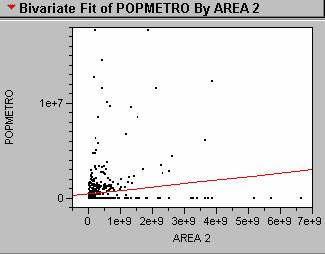
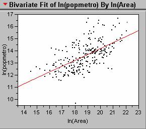
2. Transforming the data by taking the natural log of both the area and population improves the linear relationship between the variables, and results in a better regression model. The regression equation for the transformed data is shown below.
Ln(Population) = 3.60 +
0.524[ln(Area)] ;
Looking at the scatterplot
shown below, there is a marked inprovement over the
simple linear regression from question 1.
The outlier near the lower axis is Valetta ,
Malta , and the some of the
outliers near the top edge of the graph are Mexico City ,
Calcutta , and Bombay
3. Color coding the city data by GDP/capita, generated the scatterplot
shown below.
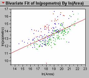
There
certainly appears to be a pattern in the distribution of points for the
different income classes. The red dots,
representing countries with GDP/capita of less than 1,000 appear above the
regression line. In these countries the
model underestimates the true population.
This makes sense since the less developed countries would have less
nighttime light output per person.
Conversely, the model overestimates the population for the richest
countries, represented by the green dots, since their nighttime light output
would be greater per person than in the less developed countries.
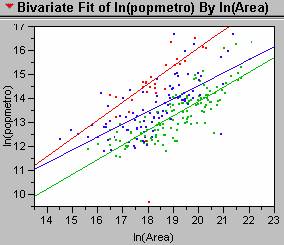
4. The new regression lines generated for each of the three income classes are shown in the scatterplot below. The equation for the red line representing those countries with a GDP/capita of less that 1,000 is:
Ln(Population)
= -0.716 + 0.837[ln(Area)] ; R2 = 0.767 ; p value <0.001
For those countries with GDP/capita between 1,000 and 5,000, the regression equation is:
Ln(Population) = 2.200 + 0.612[ln(Area)] ; R2 = 0.507 ; p value <0.001
And
for those coutries with a GDP/capita greater than
5,000, the regression equation is:
Ln(Population) = 0.876 +
0.643[ln(Area)] ; R2 = 0.709 ; p value
<0.001
These
individual regression models based on income class all have larger R2 values than the original aggregated model. Income class is definitely a confounding
variable when trying to approximate population of cities based on nighttime
imagery data. So, it may be more
accurate to identify the income class for a city and then to use the
appropriate regression equation to approximate its population.
5. I wasn’t able to find any data for Mumbai, so
I selected another Indian city with a low income class,
Global Parameters
London , England
Income Classed Regression Parameters
The
populations for Chandigahr,
6. Estimating the total global population using
just the regression equations from above, a nighttime image of the world and a
% urban figure for each nation, would involve several steps. First, the nighttime image would have to be
processed in Arc. You would need to 1)
create a binary grid of the data at a specified light level threshold, 2)
identify each light blob or cluster of light, and 3) calculate the areas for
each of the clusters (sum of the number of pixels). Then using the regression equation for the
global data, calculate a population estimate for each cluster. Assuming that you have access to the
GDP/capita data by country, you could select the appropriate regression
equation to use by income class. The
output of the regression equation gives an estimate of the urban population (UrbanPopest). The total population is the urban population
plus the rural population. To calculate
a Population estimate for each cluster you would use the following equation:
Populationest = UrbanPopest
/ %Urban
After
all the Population estimates have been calculated, then they can be summed to
estimate the total global population.
Analysis of United
States
7. Histogram
of Population Density 8. Histogram of Usatnight
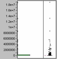
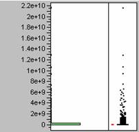
9. The histograms show that the population
density data and the nighttime light emissions data are similarly
distributed. Both sets of data are
heavily weighted towards the lower numbers, or positively skewed. Because the two sets of data have similar
distributions it does seems probable that one could be used in a model to
predict the other.
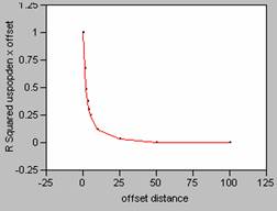
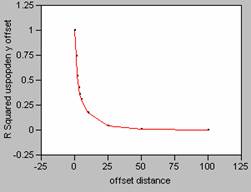
10. Correlograms for Population
Density
Offset in the X Direction Offset in the Y Direction
11. Correlograms for Nighttime
Light Emissions
Offset in the X Direction Offset in the Y Direction
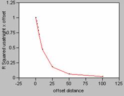
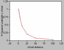
12. The correlograms
show that as the offset distance increases, the correlation as measured by R2, decays rapidly. If a perfect model (R2
= 1) is mis-registered by one pixel, it will decrease
the effectiveness of the model. When a
correlation was run on uspopden to itself, using an
offset of 1, the r value dropped from 1 to 0.8203 (x offset) and 0.8623 (y
offset), dropping the correlation coefficient value by approximately 18 and
14%. Mis-registering
a model by an offset larger than one pixel would result in even greater changes
until the offset reaches about 25, then there wouldn’t be very much correlation
between the variables of the model at all.
13. Correlograms for Population
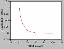
Density smoothed with a 5 x 5 filter
Offset in the X Direction Offset in the Y Direction

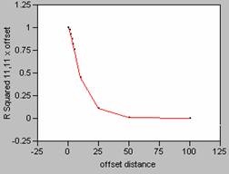
Correlograms for Population Density smoothed with an 11 x 11 filter
Offset in the X Direction Offset in the Y Direction
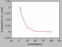
The
FOCALMEAN command in Grid, averages the values found within the window (in this
case 5 x 5 or 11 x 11), and then stores that average value at the location of
the central cell of the window in a new grid.
This effectively smoothes the data since the average
calculation takes out the highs and lows in the data. As the size of the window of the filter
increases, more data is taken into account in calculating the average causing
the data to be smoothed even more. As
the data is smoothed it also alters the shape of the correlogram
curve changes, causing it to drop off far less rapidly. This makes sense intuitively since there
would be less effect in mis-registering data with
less variability.
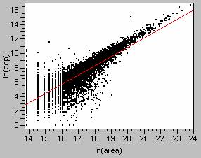
14. The regression analysis using the
ln(population) = -15.01 + 1.29[ln(area)] ; R2 = 0.715 with a p-value of
less than 0.0001.
The
scatterplot and regression line are shown below.
The
A
different method was used for the world data set analysis. For the world data, each cluster of light was
identified with the location of a city.
Then the population data for the city could be associated with the
cluster. Unfortunately, many of the
cities didn’t report a population, or reported only a population proper value,
when a population for the surrounding metropolitan area would have been a more
accurate assessment of the true population.
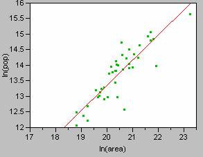
For my analysis of the world, data from 832 cities were used to generate
the regression model. By selecting just
the
ln(population) = -3.38 + 0.848[ln(area)] ; R2 = 0.710 with a p-value of
less than 0.0000.
The
scatterplot and regression line for the analysis are
shown below.
I believe that the regression parameters calculated using
the
15. The correlation coefficient between the uspopden grid and the usatnight
grid was 0.4919. The positive
coefficient implies that there is a positive correlation between population
density and the nighttime emission levels, so as one increases the other will
also increase. Whether a correlation
coefficient is significant is dependent on the sample size. Since these grids contain a lot of data, and
R is dependent on sample size, the magnitude of the correlation coefficient
does not provide much information. For
more information about the relationships between two variables a regression
analysis is typically run.
16. Looking at the scatterplot
for the first
ln(population) = -18.40 + 1.489[ln(area)] ; R2 = 0.9500 with a p-value of
less than 0.0000.
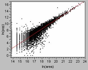
This
weighted regression model has a higher R2 value,
this model accounts for 95% of the variation in the data. Looking at the scatterplot,
you can see how much better the line hugs the observation points.
Analysis of the Los Angeles
17. To create a model of population density
prediction for Los Angles, I used Arc to create a table containing the grid
values for lanightradcal, lapopdensity,
lajobdensity.
This table was exported into JMP and regression analyses were run on the
data. The regression results are show
below.
Regression Model for Population Density vs. Nighttime Light Emissions
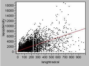
lapopdensity = 431.39 + 8.77lanightradcal ; R2=0.441 ; p value<0.0000
Regression Model for Employment Density vs. Nighttime Light Emissions
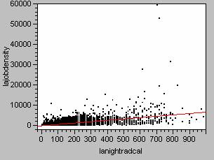
lajobdensity = -50.23 +
6.73lanightradcal ; R2=0.340 ; p value<0.0000
Regression Model for Ambient Population Density vs. Nighttime Light Emissions
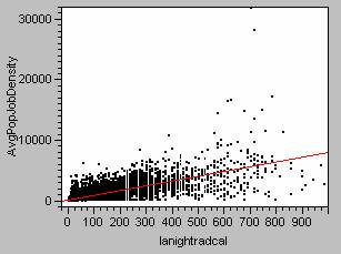
AvgPopJobDensity = 190.58 + 7.75lanightradcal
; R2=0.54 ; p value<0.0000
To
create a population density estimate for
a) Correlation between my
population density estimate and the residence based population density, 0.5397.
b) Correlation between my
population density estimate and the employment based population density, 0.4693
c) Correlation between my
population density estimate and the average of the two, 0.5932.
18. The correlation between the grids suggests
that the average of the residence and employment based population densities
would give the best results when attempting to define a model between nighttime
light levels and population. This
average would take into account the illumination from residential areas plus
the lights from any large industrial or commercial areas. Using this measure of ambient population density
will hopefully result in a model with greater accuracy in predicting
populations from nighttime light emissions.
19. I created a new grid using the ambient
population density regression equation and then created the error grids shown
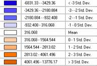
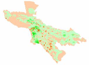
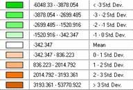
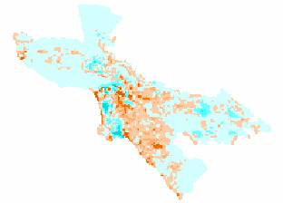
below. The data is displayed in standard
deviations to allow for comparisons between the maps.
Population Density – Ambient Population Density Estimate
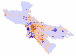
Employment Density - Ambient Population
Density Estimate
Ambient Population Density – Ambient Population Density Estimate
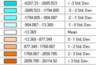
Reviewing
the maps, the patterns of error appear to be very similar between the
population density error map and the ambient population density error map. The central areas are underestimated
(oranges), since the positive error means that the model values are
smaller. The outskirts of the city are
overestimated on both of these maps (negative errors – in blue and cyan). Far more areas on the maps are overestimated
than underestimated (more blue and cyan than orange). The pockets that are highly overestimated
(dark blue and dark cyan) occur in the same locations on the two maps. So it appears that the locations of these
errors are not random and possibly are caused by autocorrelation between the
data sets. The patterns on the job
density error map are different. There
are more areas in the orange tones, indicating that the model underestimates
the job density throughout much of the map.
Some of the same pockets of heavily underestimated areas (darker green)
occur in the same locations and patterns as the other two error maps. I’d have to say that the job density map
seems to be the most random, since its error patterns are different from the other
two.
To
find the smallest mean absolute deviation, the absolute values of the grids
were calculated using Arc. Using Arc’s
Describe function the means of the absolute value grids were found. The means for the three maps were:
Population Density Error - |mean| =
746.98
Job Density Error - |mean| = 611.281
Ambient Density Error - |mean| =
496.07
The
smallest of these values is the |mean| for the ambient density error map.
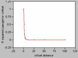
Correlogram for LA Population Density Error
X offset Y
offset
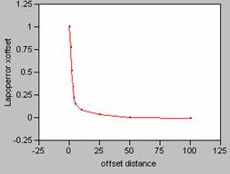
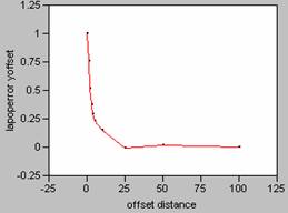
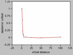
Correlogram for LA Employment Density
Error
X offset Y
offset
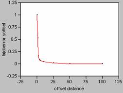
Correlogram for LA Average Population and Employment Density Error
X offset Y
offset

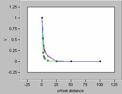
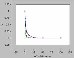
Plotting the correlograms for the three error maps for x and y offset simultaneously yields the following graphs.
![]()
![]()
In the Focal Mean question done earlier in this lab,
the correlograms of the smoothed data showed a marked
softening of the decay pattern for the curve.
So, the more variability in the data, the sharper the
decay pattern shown in the correlogram. For the three error maps calculated for this
data set, the curves for the job density error map have the sharpest decay
patterns, and so, the job density error map contains the most variability. Increased variability on an error map would
indicate more random errors. This
supports the discussion of which map was more random from earlier in this
question. Visually the job density error
map appeared to be the most random, and that has been confirmed by reviewing
the shape of the correlogram curves. It is interesting to note that the correlogram curves for the other two error maps, population
density and ambient density plot almost as one curve, an indication of how
truly similar those two maps are.