Lab Exercise #2: By Jennifer
Doe
Due May 6, 2003
World
Data:
Question
1: Run a simple linear regression between Area_1 (from earthlights poly
coverage) and PopMetro from the worldcities.
Describe the results and problems.
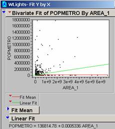 The R2 is
0.052868 meaning that the simple linear regression model used here only
accounts for 5.29% of the variation in the data. Because F = 141.7794 the probability is
<0.0001 that this is occurring by chance.
Some of the world cities have the same earthlights polygon associated
with them because they are very close together.
In general there are data gaps where one piece of data is present but
not both pieces required for the analysis.
There are also many more small cities than large ones so there is a big blob
of data points very close to the origin.
In the large cities the population does not seem to respond linearly to
the area the light occupies.
Question
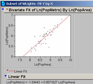
2: Run a simple regression on the
Ln(Area_1) and Ln(PopMetro). Describe
the results and problems.
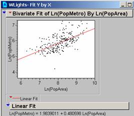 The regression line
generated by the Observations available (253 observations) is on the Bivariate
Fit of Ln(PopMetro by Ln(PopArea) printout.
The R2 is 0.363861 meaning that the new model using the log
values now accounts for 36.4% of the variation in the data. The F = 143.5677 and the probability is
<0.0001. There are still some points
where the Population is significantly larger than the Model would predict.
Question
3: Color-code your points with red, blue
or green for GDP/capita. Run the same regression on Ln(PopArea) vs
Ln(PopMetro). Describe the results.
For
reasons unclear to me, at this point some of the GDP data didn’t attach
correctly to the table. The most
annoying of these omissions was that no GDP data was attached for the
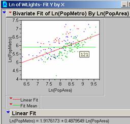 The green dots for the
highest GDP/capita countries fall mainly below the line especially if the area
(light polygon is small). The model is
overestimating the population of these polygons. The red dots tend to be above the line and in
areas where the area (light polygon is large).
The model underestimates the population of these polygons. The explanation for this might be that the richest
countries have more lights on at night…they have money to pay for the energy
for them.
The
R2 = 0.3365
The
Probability = <0.0001
This
line is very similar to the one above.
Question
4: Run separate regressions on the three
Income Classes based on the GDP/capita color codes. Describe and explain the difference.
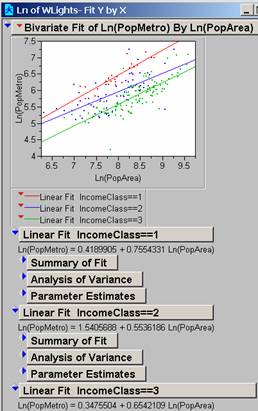 Based on my improved data
the lines all look pretty similar in slope but the intercepts increase with
decreasing income.
The
complete printout is attached
Lower
Income: observations = 23
The
R2 = 0.7825
The
Probability = <0.0001
Medium
Income: observations = 58
The
R2 = 0.4444
The
Probability = <0.0001
High
Income: observations = 123
The
R2 = 0.6197
The
Probability = <0.0001
This
does improve the R2 at each income level from the models above.
Question 5: Assume you only had
the regression knowledge from the previous exercises and you had to estimate
the populations of
a)
What would your
estimates and 95% confidence intervals be for those cities if you used the
global parameters?
The Equation for the Ln(PopMetro) by Ln(PopArea) is
Ln(PopMetro) = 1.9176 + 0.4880 Ln(PopArea)
Lower 95% Ln(PopMetro) = 1.1395 + 0.4880 Ln(PopArea)
Upper 95% Ln(PopMetro) = 2.6958 + 0.4880 Ln(PopArea)
For
Lower95% = 221,875 Upper95% = 7,987,462 Actual from
PopMetro = 14,482,636 OUT
For
Lower 95% = 144,020 Upper 95% = 5,184,704 Actual from
PopMetro = 1,832,321 OK
For
Lower 95% = 388,487 Upper 95% =13,985,461 Actual from
PopMetro = 9,591,757 OK
b)
What would your
estimates and 95% confidence intervals be for those cities if you used the
regression parameters derived after sub-setting the data to ‘rich’,
‘mid-income’ and ‘poor’?
The Equation for the “Poor” Ln(PopMetro) by
Ln(PopArea) is
Ln(PopMetro) = 0.4190+ 0.7554 Ln(PopArea)
Lower 95% Ln(PopMetro) = - 1.0219 + 0.7554 Ln(PopArea)
Upper 95% Ln(PopMetro) = 1.8599 + 0.7554 Ln(PopArea)
For
Lower95% = 308,832 Upper95% = 235,246,000 Actual
PopMetro = 14,482,636 OK
The Equation for the “Mid-Income” Ln(PopMetro) by Ln(PopArea)
is
Ln(PopMetro) = 1.5406 + 0.5536 Ln(PopArea)
Lower 95% Ln(PopMetro) = 0.2314 + 0.5536 Ln(PopArea)
Upper 95% Ln(PopMetro) = 2.8497+ 0.5536 Ln(PopArea)
For
Lower 95% = 61,741 Upper 95% = 25,637,330 Actual from
PopMetro = 1,832,321 OK
The Equation for the “Rich” Ln(PopMetro) by
Ln(PopArea) is
Ln(PopMetro) = 0.3476+ 0.6542 Ln(PopArea)
Lower 95% Ln(PopMetro) = - 0.4231 + 0.6542 Ln(PopArea)
Upper 95% Ln(PopMetro) = 1.1182+ 0.6542 Ln(PopArea)
For
Lower 95% = 348,568 Upper 95% = 12,122,386 Actual from
PopMetro = 9,591,757 OK
Question 6: How could you use
these regression models, a nighttime image of the world, and a % urban figure
for every nation of the world to estimate the total global population?
Do the same as this lab;
create a (0,1) grid at specific light intensity and use region group in arc to
group the connected areas. Convert the
grid to a polygon coverage from the light pixel groups that contains area. Use the regression line. Estimate each urban area and add up the total
for the country. Use the % urban as a
divisor (Urban total population)/% urban to get the total population.
Or if your lazy like I am, I
would simply add up all the light polygons in each county first, fit the total
areas into a new regression equation created similarly to the lab but with
total urban area instead of area for each city and get the total urban from the
line then divide as above. It’s easier
to be spatially accurate when joining big polygons than little. There would probably be less data loss and if
you were looking for a country’s population it would be easier to calculate
(just one result total urban). Maybe
then the GDP/capita would work better to separate the groups with.
Question 7: and Question 8:
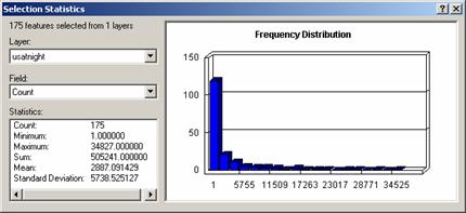
The Histogram of Population
Density from uspopden grid and the Histogram from usatnight grid are NOT very
enlightening as almost all the pixels are very low numbers. Even selecting only those pixels with values
over 1000 from the uspopden grid, the histogram for the data is highly skewed
to low-end values. The grid has 6455
different values so this removed the lowest 15% of the values.
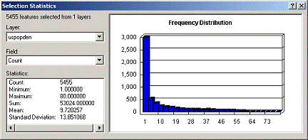
The usatnight grid has fewer grid
values than the uspopden grid and the one shown below is selecting the pixels
with values over 20. This grid has 195
different values so I removed the lowest 10%.
Question
9: Comment on the likelihood that a
model derived from nighttime light emission could predict population density.
The
data has a similar distribution, very skewed to the low end. Based on the fact that the usatnight grid has
195 values and the uspopden grid has 6455 values, the usatnight grid has only
3% of the sensitivity of the uspopden variation (195/6455). It would take a 33-value count change in
uspopden to make a 1 value count change in usatnight (assuming a linear
proportional relationship). It might be
possible to create a model using usatnight data but the accuracy will be about
1% of the uspopden information.
Question
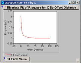
10: Correlogram of uspopden

Question
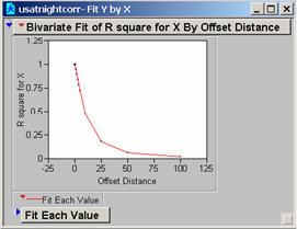
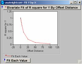
11: Correlogram of usatnight
Question
12: What does the Correlogram of the
popdensity data suggest about the effectiveness of a perfect model it is
miss-registered by one pixel?
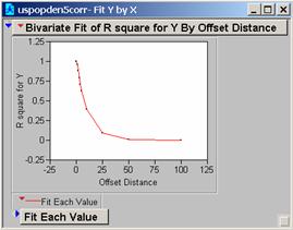
The
steep drop-off in the values suggests that within a miss-register of five
pixels the ability of the model to provide useful estimates of the population
drops to about 50% from 100%
Question
13: Generate two new correlograms for the ‘smoothed’ data. How does focalmean work, and how does it
change the data?
Focalmean:
for each cell location on an input grid, finds the mean of the values within a
specified neighborhood and sends it to the corresponding cell location on the
output grid. It is a form of smoothing
the data by averaging the cell values around it (5X5, of 11x11 in our choices),
and creating a new grid of those smoothed values. The larger the neighborhood the smoother the
data becomes.
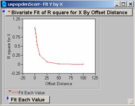
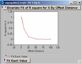
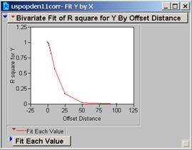
The
correlograms for these two new grids drop-off more slowly, the model would work
better because the changes in the grid are less extreme.
Question
14: Perform the same Ln(area) vs. Ln(Pop) regression on the
a) How is the regression
equation for the
b) Which regression parameters do you think are
more accurate?
c) Does this
There
are many more observations for this set of data (6369 observations) than for
the World data (41 observations)
With
data at the same resolution for the
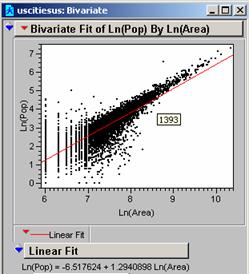
I
think the
It
strengthens the view that a model for population based on the DMSP OLS
Satellite data would be an alternative to the population data that is available
in some countries. In a way, it is a
form of calibration, taking known populations and creating the linear
relationship against our detector the DMSP OLS Satellite. It should then be possible to use the
detector data with the curve to find values for unknown populations of other
cities. One useful additional effort
(assuming the goal is to Predict populations for cities in other countries,
where the population is unknown) would be to check one or two reference city in
that country where the population data is good vs. the curve results to
determine if the result is within the 95% confidence interval (or even to
create a correction factor if the error is a constant). This would then provide a QC on the data
being generated. Theoretically, curves
for the three GDP categories could be created from three country’s data (one
for each GDP) where the population density data is available and extrapolated
to the other countries where the population data is limited. The accuracy of the predicted populations
could then be verified using a very limited number of cities (with better data)
in the country being studied.
Question
15: Comment of the R correlation for the uspopden vs. usatnight grids and
provide an explanation.
The
correlation is 0.4919, which isn’t great!
I should point out that the uspopden11 data correlates a bit better at
0.5591. So smoothing the data does
improve the correlation.
Question
16:
I
tried a few refinements to the simple model.
I used the slice command in Grid to reclassify the data in the unpopden
grid since smoothing the data seemed to help above. I used the equal interval slice and tried 200
and 100 for interval slices (reclassifying the data). Unfortunately, none of these reclassification
efforts produced the desired effect of improving the correlation between the
new uspopden grid and the usatnight grid.
Most of these efforts resulted in correlations lower than the original
grid produced. Perhaps using 10 or 20
might have worked better…it would appear from the above exercise that the
relationship is not a truly directly proportional one.
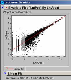 You had mentioned in class that
weighting the data with the area improved the correlation and that is what is
shown above. It is pretty obvious that
the number of small cities was affecting the slope and the intercept of the
line. The R2 value is 0.9504
for the weighted line. Quite an
improvement in correlation.
Question 17: Apply your model of population density
prediction from before to the
a) What is the correlation of your model to residence based population density?
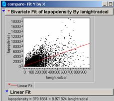 Based on the Grid Correlation command in Arc
the correlation R is 0.5262
Based on Jump the R2 is 0.4646
And the Probability is 0.0000
b) What is the correlation of your model to employment based pop. density?
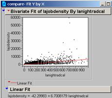 Based
on the Grid Correlation command in Arc the correlation R is 0.4428
Based on Jump the R2 is 0.3514
And the Probability is 0.0000
c) What is the correlation of your model to the average of these two?
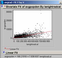 Based on the Grid Correlation command in Arc
the correlation R is 0.5704
Based on Jump the R2 is 0.5614
And the Probability is 0.0000
I have no explanation for why the R in Arc when squared isn’t equal to the R2 in Jump.
Question 18: What do your results above suggest regarding your model’s ability to predict ‘ambient’ population density?
The R and R2 values for the Average Population are higher than either of the other records of population itself as it relates to the light data available. Of course this means that the night light data is better at estimating the ambient population than the population density of the city or the job population density.
Question 19: Visualization of Error
a) Which errors look most random?
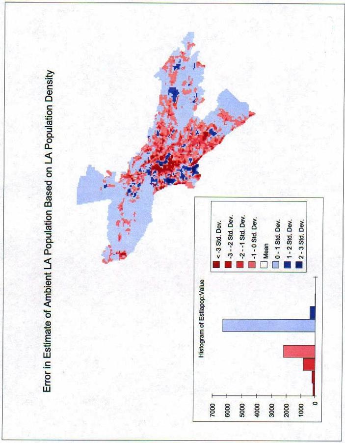
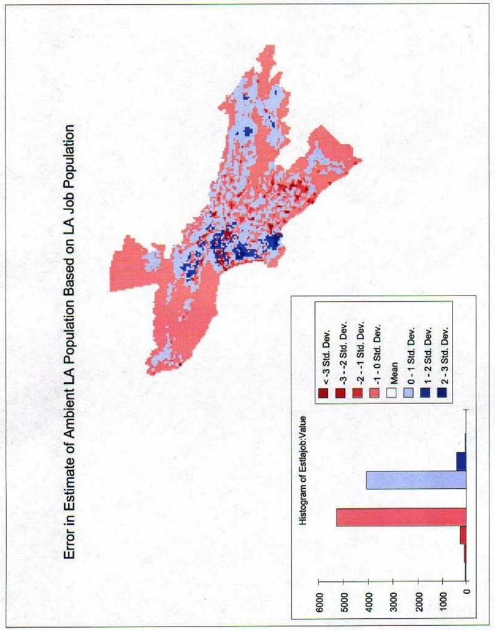
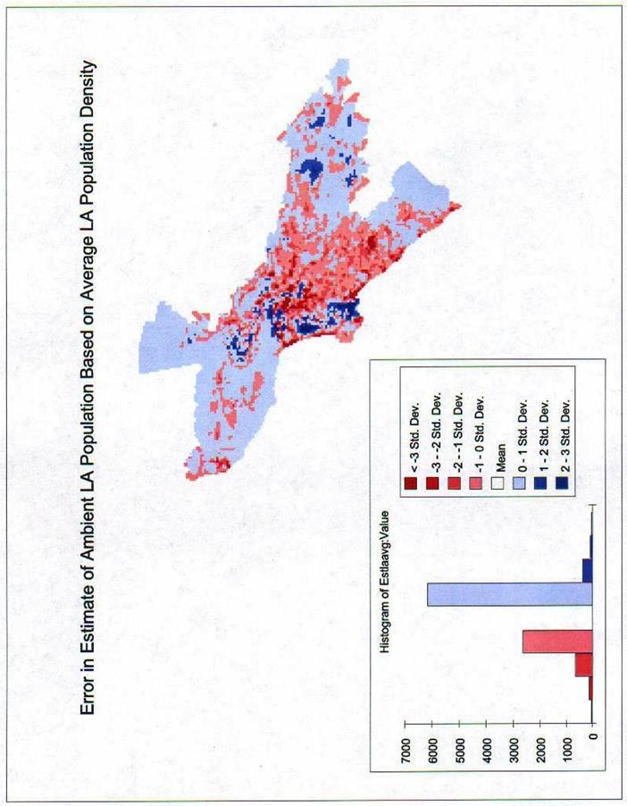
See the attached maps. The LA Population Density seems to have large areas of Red in the center indicating our estimate is too low in a lot of the center of the study area. The Estimate of LA Job Population seems to be the one with the fewest extremes and could therefore be considered the most random. Based on the Histograms, it is surely the most normally distributed. The Ambient Population is what it was designed to be, the average of the two.
b) Which ‘map of residuals’ has the smallest mean?
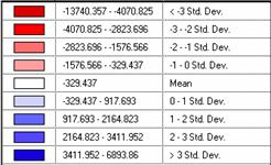 This
is the Estimate of LA Population Density error by Std. Dev. Notice that the mean for this data vs. the
estimate is negative 329.437. The
Standard Deviation for this data is 1247.13.
Our estimate is too low.
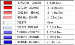 This
is the Estimate of LA Job Population error by Std. Dev. The mean here is a positive 328.978. The Standard Deviation for this data is
1179.889. Our estimate is too high.
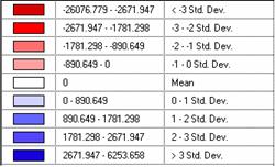 This
is the Ambient LA Population error by Std. Dev.
I suppose that it should not be surprising that since we used the
Average data to create the line we then created our estimated population from
that the mean should be 0. The Standard
Deviation for this data set is 890.649.
By far this is the narrowest
c) Produce correlograms for each of these residual maps.

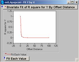
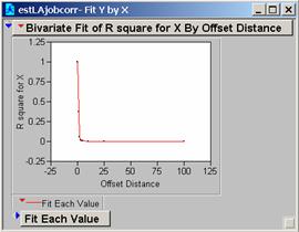

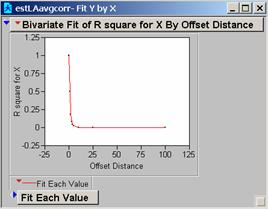
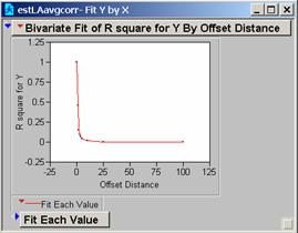
a) What do these correlograms suggest about these three images?
All three sets of the correlation correlograms for the grids using different population estimates drop off fairly quickly. The Estimate of the Average Population drops off a bit less quickly and might be the best choice for a model as it appears to be slightly less affected by 1-unit changes in the grid.
 thkeljklksdjlk
Population Estimation for
the city of
Tippecanoe County , Indiana
By Janice L Vaughn
This study area for the Lafayette-West Lafayette
metropolitan area includes the complete
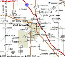 This
MapQuest™ map provides an overview of the metropolitan area. The stable
population and the business community reside on the east side of the Wabash
while the university occupies most of
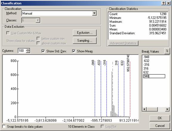
Using the USPOPDEN grid and the USATNIGHT grid, I generated two grids for the area data, TIPPYPOP and TIPPYLIGHTS. The regression equation generated from these two grids is shown below.
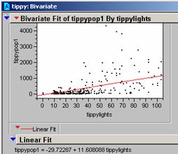 The
R2 for the data is 0.3214, so the relationship shown accounts for
32% of the variability in the data. The
regression line is shown below the curve and the probability = <
0.0001. The original data with the
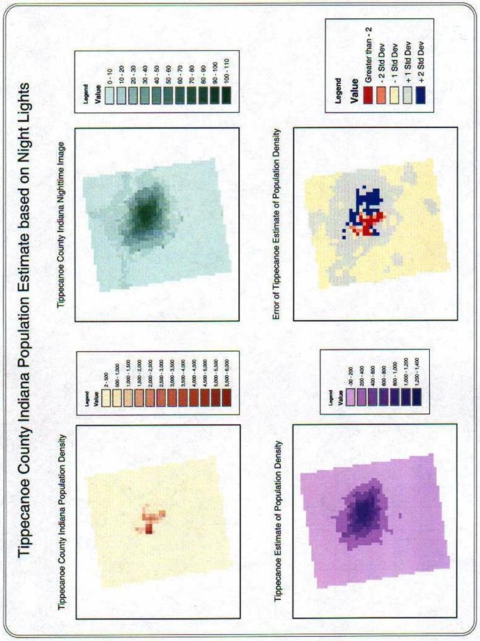
created population estimate grid is shown on page two with the error grid. The model estimates the population to the
southwest lower than it is.
An explanation might be that the students are not counted in the census data. Shown in the classification window below are the mean, Standard Deviation, and the Histogram of the data. There is a bit of a skew to the high end of the curve. The map of the error of the population estimate shows very clearly that the residuals are not random spatially. The under-estimates are to the southwest and the over-estimates are east.
