John Doe
GEOG 3650 – Spatial Statistics
Lab #2 – Correlation, Regression, and Modeling of Population and Population Density with Nighttime Imagery Provided by the DMSP OLS Satellite
ANALYSIS OF WORLD DATA
Procedure: (using ArcView Spatial Analyst)
a. Select earthatnight grid and set pixel threshold to 36 using map calculator to isolate smaller light patches from significant urban centers.
b. Convert threshold output to grid and then convert to shapefile to get numbered polygons with unique ids.
c. Run calculate.feature.geometry script to obtain areas and perimeters of polygons in cluster table. You will have to cut and paste this script into the script window using Notepad. Compile and Run the script.
d. Do a spatial join (can use Geoprocessing Wizard) between Wrldcluspoly table and Worldcities cover. This aggregates cities with correct polygons and provides a table with some of the required city information such as population, country fips code, etc.
e. Import NationalPopIncomeUrbanData table into ArcView as a .dbf conversion from Excel. This table contains the required GDP/Capita table and a field with fips_cntry code.
f. Join the NationalPopIncomeUrbanData table to the Worldcities table on the fips_cntry. Join Worldclusterid table with counts and values on the value field to the wrldcluspoly_id field in the Worldcities table.. You now have cluster counts, city names, GDP/Capita, and population figures in a single table. Export this table from ArcView as a .dbf file and bring it into JMP as a MSDOS text file for the rest of the statistical analyses.
1) Run a simple linear regression between area and total population for each of the cities in the table. Describe the results and problems.
First, be sure to clean up the imported JMP table. I removed all rows with no valid Area2 or PopMetro data. Even when this is done you will find countries with no GDP/capita data. World data is not as complete or as accurate as data for individual countries because of the vary levels of census quality.
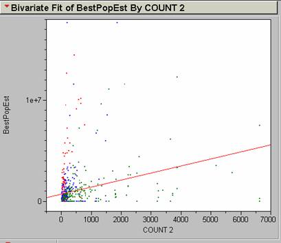
Run the regression using Analyze à Y x X Fit. Put Count2 on the X axis (independent variable) and BestPopEst on the Y axis (dependent variable). The correlation and best R2 values show no significant relationship. R2 = .071205. There are a lot of outliers that affect the position of the regression line.
2) Transform your area and total population values to Ln(Count2) and Ln(BestPopEst) and run the regression again. Describe the results and problems.
Make new columns for the new variable and populate them with the formula editor, then run the Y x X fit.
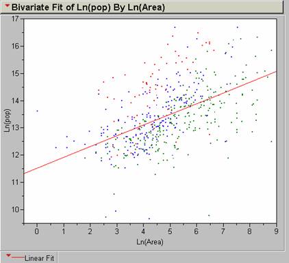
A much better correlation exists for the transformed values. R2 = .26119 with an n = 498. This is a weak positive correlation.
3) Color code your points so that points representing cities in countries with GDP/capita less than $1000/yr are red, $1001-$5000/yr are blue, and over $5000/yr are green. Run the same regression on Ln(Area2) and Ln(total population). Describe the results.
I deleted rows that did not have PopMetro, and GDP/capita values before running the regression. I was able to find a way to color the points and the corresponding regression lines. Create a new column called GNPCODE and populate it with the formula below:
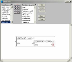
In the regression set up proceed as usual but select Group results by GNPCODE.
The resultant regression yields interesting results:
The rich get richer and the poor get poorer?
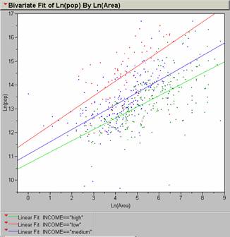
The red curve is for GDP/capital less than $1000, the blue for GDP/capita from $1001-$5000, and the green is for over $5000.
a. The population of “red” individuals falling into the lower group is greater than all the other groups. “Green” individuals are the smallest of the three groups on a worldwide basis.
b. The number of “red” individuals increases faster with area than the other groups. Regression slopes are steeper for this group.
c. The number of “blue” individuals falls as area increases, possibly implying that some of the “blue” group becomes part of the “red” group as urban areas increase.
d. Proportion of “green” individuals remains fairly constant as area increases.
e. The spread between the “reds” and the “greens” increases with greater area.
The three regressions coefficients were:
GDP/capita $1001-$5000/yr
The strength of the correlations varied for each
group. This might be an outcome of
instability due to the small size of the dataset. After the bad instances were rejected from the table
there were only 63 instances of “red”, 191 “blue”, and 244 “green.” This is low for a dataset that should represent
all significant world cities. There should be many more “red” individuals than “green”
individuals in the cities of the world.
This assumption is borne out even by the limited dataset available
here; lowest levels show the most under-representation. Possibly, this might be due to unreliable
census results from poorer countries if the rest of the data is generally
valid. R2 = .315424
“red” R2 = .385845 “blue” R2 = .444432
“green”
There are numerous other factors controlling the proportions of high GDP individuals than area. Commercial centers might attract a greater numbers of this population relative to the total population than large cities with agricultural bases.
5) Assume you only had the regression knowledge
from the previous exercises and you had to estimate the populations of
Global Model
Area = 30 km2
ln(BestPopEst) =11.521928 + 0.3949183 (lnCount2) = 12.8651
Population inference = 386,591
Area = 172 km2
ln(BestPopEst) =11.521928 + 0.3949183 (lnCount2) = 13.5548
Population inference = 770,469
Area = 1,199 km2
ln(BestPopEst) =11.521928 + 0.3949183 (lnCount2) = 14.3216
Population inference = 1,658,790
GDP/year Models
Find out where they rank in GDP/year and then match the regression curves to come up with an estimate of population by inferential statistics.
Area = 30 km2
GDP/year = < $1000
ln(BestPopEst) = 11.67688 + 0.6232436(ln Count2) = 13.7967
Population inference = 981,321
Area = 172 km2
GDP/year = between $1001 - $5000
ln(BestPopEst) = 11.093064 + 0.5191704(ln Count2) = 13.7655
Population inference = 951,211
Area = 1,199 km2
GDP/year = > $5000
ln(BestPopEst) = 10.702647 + 0.4756215(ln Count2) = 14.0744
Population inference = 1,295,550
One would have to be very careful to get accurate polygon clusters for cities or weight them in some manner for country light variations. Will use them and hope they are all off by the same factor. Use the regression equation to estimate population and blame the errors on models that have poor R2 values. These models don’t account for individual variations in specific cities. The correlations vary from R2 values of .315424 for low-income nations to .444432 for high income nations. These are probably not the greatest predictors for population at the city level.
Global model –
To obtain 95% confidence intervals we incorporate the standard error of intercept and standard error of x in the regression estimate.
Global Model—
e(11.521928 + 1.96 (.151026) + (0.3949183 + 1.96(.029709))ln(Count2)) = upper limit
e(11.521928 - 1.96 (.151026) + (0.3949183 - 1.96(.029709))ln(Count2)) = lower limit
e(11.521928 + 1.96 (.151026) + (0.3949183 + 1.96(.029709))ln(30)) = 633,607 = upper limit
e(11.521928 - 1.96 (.151026) + (0.3949183 - 1.96(.029709))ln(30)) = 235,876 = lower limit
At a population inference
of 386,591
e(11.521928 + 1.96 (.151026) + (0.3949183 + 1.96(.029709))ln(172)) = 1,397,950 = upper limit
e(11.521928 - 1.96 (.151026) + (0.3949183 - 1.96(.029709))ln(172)) = 424,650 = lower limit
At a population inference
of 779,469
e(11.521928 + 1.96 (.151026) + (0.3949183 + 1.96(.029709))ln(1199)) = 3,369,970 = upper limit
e(11.521928 - 1.96 (.151026) + (0.3949183 - 1.96(.029709))ln(1199)) = 816,502 = lower limit
At a population inference
of 1,658,790
GDP/year models-
low
GDP/year:
e(11.67688 + 1.96 (.517829) + (0.6232436 + 1.96(.114618))ln(30)) = 5,813,440 = upper limit
e(11.67688 - 1.96 (.517829) + (0.6232436 - 1.96(.114618))ln(30)) = 165,649 = lower limit
At a population inference of 981,321
medium
GDP/year:
e(11.093064 + 1.96 (.211773) + (0.5191704+ 1.96(.047321))ln(172)) = 2,322,120 = upper limit
e(11.093064 - 1.96 (.211773) + (0.5191704 - 1.96(.047321))ln(172)) = 389,644 = lower limit
At a population inference of 951,211
high
GDP/year:
e(10.702647 + 1.96 (.191868) + (0.4756215 + 1.96(.034026))ln(1199)) = 3,027,640 = upper limit
e(10.702647 - 1.96 (.191868) + (0.4756215 - 1.96(.034026))ln(1199)) = 554,373 = lower limit
At a population inference of 1,295,550
6) How could you use these regression models, a nighttime image of the world, and a % urban figure for every nation of the world to estimate the global population?
Do the GDP appropriate regression estimate for each major city in a nation.
Sum each individual nation’s population estimates from the city level aggregations. Estimate each nation’s population based on the percent urban:
total national population = (100 * urban population) / (% urban)
Sum these estimates for all the nations in the world.
ANALYSIS OF UNITED
STATES DATA
Import in the prepared clusterareasumpop table to JMP. This table was prepared by making a cluster id polygon table based on light values. These polygons were then combined with the PopDen grid and summarized to produce a count of population density per cluster polygon. Since each cell is 1 km2 we know the area directly. The population numeration comes from the PopDen grid values.
7) Produce a histogram of the population density data. Some unusually high value outliers are causing the PopDen data to be poorly scaled. I deselected the highest values in ArcView to get a better display. I’m assuming that these histograms show count levels for each value.
population density
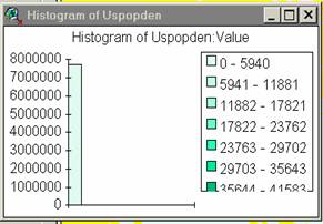
The greatest majority of values fall in the range from
0-5940 for the
8) Produce a histogram of the Usatnight data.
Usatnight value
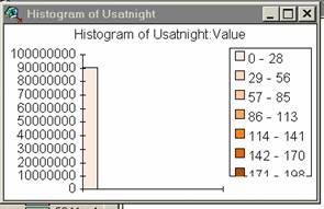
9) These histograms show that the distribution of light pixels (1 km2 ) of specific values generally reflects the distribution of population densities. Since lights vary with population the distribution of specific light values reflects the distribution of population densities. In general, the histograms of light values and pop values correspond, suggesting that nighttime light values might be an acceptable proxy for population density.
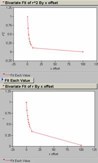
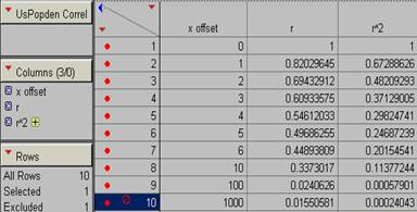
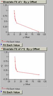
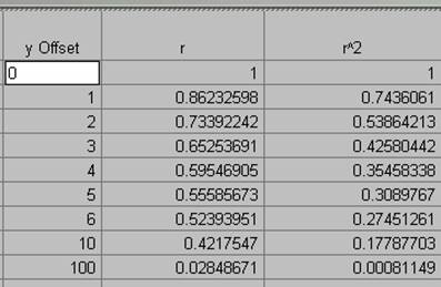
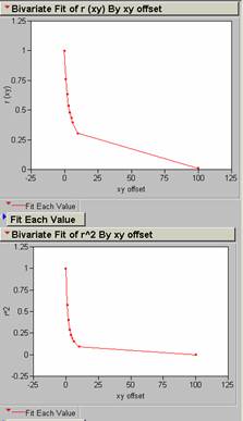
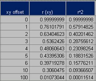
10) Produce a correlogram of the pop density data.
offsets in x for PopDen
offsets in y for PopDen
offsets in xy at a 450
angle for PopDen
11) Produce a correlogram of the Usatnight data.
Offsets in x, y, and xy (450) for Usatnight.
0
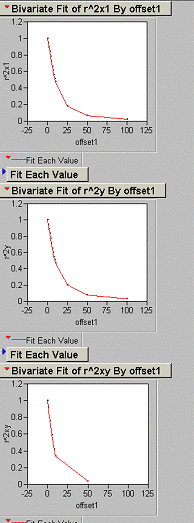
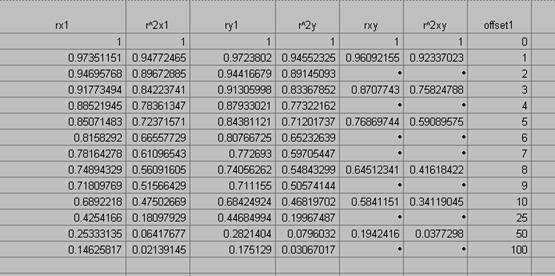
12) An offset of one pixel (1 km2) in the x, y, or xy direction results in an average decrease in R2 of 33% for the population density grid.
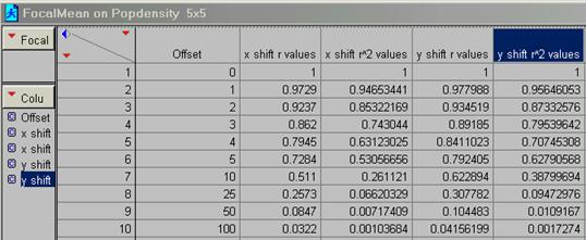
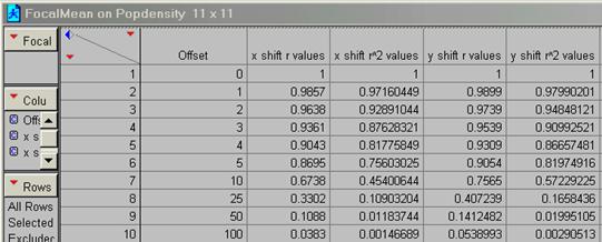
13) Run a FOCALMEAN on the pop density data (use a 5 x 5 and an 11 x 11 filter). Now generate two new correlograms for the ‘smoothed’ data. How does FOCALMEAN work and how does it change the data?
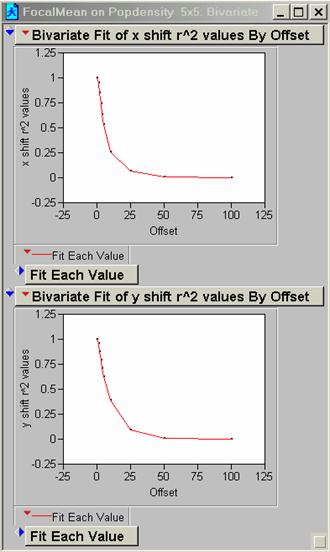
5 x 5 R2
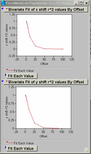
11 x 11 R2
FocalMean is a spatial filter. The user specifies the number of pixels and shapes to average over and this average value replaces the original centered pixel value in the grid. The net effect is to take out the high frequency variations in the data set. After running FocalMean the correlogram should show an improvement in proportion to the size of the sample grid. The 11 x 11 matrix is a more severe filter than the 5 x 5 matrix. These relations are seen when we compare the 5 and 10 pixel offsets in the x direction for PopDen before and after smoothing:
|
R2 / pixel shift |
PopDen no filter |
FocalMean 5 x 5 |
FocalMean 11 x 11 |
|
5 |
.24687 |
.53057 |
.75603 |
|
10 |
.11377 |
.261121 |
.45401 |
I’m not sure that removing the high frequency portion of your data is a good idea, although the areal filters specified in pixel groups of 5 or 11 are not all that severe with regard to the total area and may serve to reduce noise or meaningless variations.
14) Perform the same Ln(Area) vs. Ln(Population) regression on this data. How is it different than the results for the
U. S. data only, n = 6347
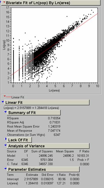
R2 values for the world are lower than for the U. S. except when we compare the “poor” or “red” segment of the world population with the U. S. In this case the U. S. R2 value is significantly better than the world value, .718354 vs. .444432
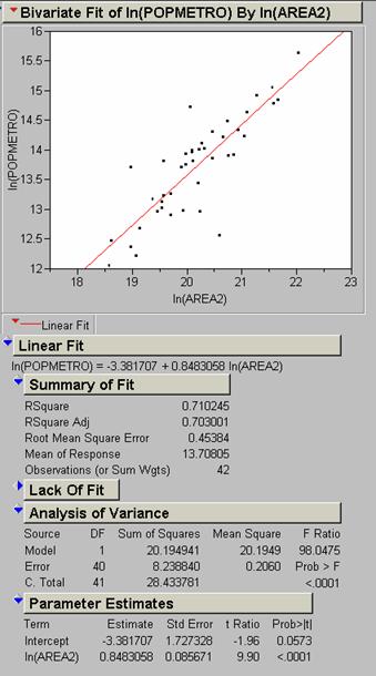
I selected the
Our main problem is not in getting a high correlation, but in
deciding if area is a good predictor of population density. Since area is derived from the extent of
lights we need to decide if lights themselves are a precise indicator of
population density. In the
I think that the DMSP OLS imagery is excellent for predicting population because in the main, lights are a good proxy for population. One would also have to be careful to adjust the data and interpret it correctly when trying to estimate population for individual nation aggregates.
15) Use the
CORRELATION command in grid to get a simple correlation coefficient between the
The R2 value is .241931. This is a fairly low value showing poor covariance. Reasons probably might include such things as the PopDen data coming from a cruder sampling interval than represented by the nighttime lights coverage. The satellite imagery records a rather continuous data stream, only degraded by the 1 km pixel dimension; the PopDen has been derived by census sampling and then aggregation. Each aggregation unit probably covers much more than 1 km. The sampling procedure used in gathering the census data is much poorer quality than the information provided by the scans of lights. Other reasons may be data that comes from two different dates. This is also the general question, to what degree does light reflect population at the scale we are interested in? This could be a root cause of poor correlations in localized areas.
16) Model building: Build a better model, describe/define it, justify it, and evaluate it. Describe how it compares to the simple aforementioned model.
The most
obvious immediate way to get a better model is to go through the table and
through out weird outliers or data that doesn’t make sense to produce a better
input, although I think that the sheer quantity of good data in the
It would be
neat to repeat the study every ten years or so for selected cities in the
Out present model depends on the degree to which nighttime lights vary with population density. If we could find a better proxy than lighting we could produce a more precise model, especially over smaller city-size areas. One might consider pollution emissions, car or gun registrations, welfare applications, number of first graders entering school, number of physicians, mall areas, or number of roadways converging on a city. None of these would be easy to gather, compared to satellite reconnaissance, and the models would be much more complicated than even these regression equations and would not provide the possibility of gathering the data for the entire country. If we tried to combine lights with some other more complex indicators we probably limit the generality of the models.
ANALYSIS OF LOS ANGELES DATA
For this
analysis I followed the procedure used to produce the
In ArcInfo I used the SAMPLE function to produce an ASCII text file. The text file contains the x and y coordinates and respective cell values of any two selected grids. You can also apply a mask if necessary to limit the sampled area. Masking is important to limit the size of the data set and to eliminate outliers that you do not want influencing the analysis. This text tables allows one to run a regression between the LAAMBIENT and LANIGHTRADCAL coverages. The LANIGHTRADCAL set consists of the low gain light acquisition coverage with a radiance adjustment.
17) To apply the model I used the regression equation obtained from JMP:
LADENEST = 168.21918 + 7.8361837 (LANIGHTRADCAL)
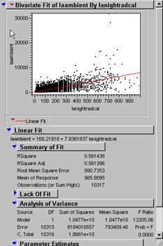
R2 = .561396 then R necessarily must be .748596. I wonder is this would be close to the R-value you would get by the ArcInfo zero-lag spatial correlation of grids LAAMBIENT and LANIGHTRADCAL. Grid pixel summing essentially predicts the proportion of total variation in one grid explained by the other. The actual value using the function CORRELATION (lambient, lanightradcal, 0, 0) = .5932264054485 for a R2 –value of .593226. The pixel-to-pixel summing correlation is a different process than the line fitting used in the regression estimate.
Correlations of new
model LADENEST to population density grids at 0 x, y shift:
|
Cover |
Cover |
R
value |
R2 value |
|
LADENEST |
LAPOPDENSITY |
.5397405925319 |
.29132 |
|
LADENEST |
LAJOBDENSITY |
.4693194788425 |
.220261 |
|
LADENEST |
LAAMBIENT |
.5932264061103 |
.351918 |
18) The best correlation occurred with the LAAMBIENT average grid, but the R2 value of .3519 is nothing to write home about. This LAAMBIENT average grid is a measure of the ambient population density and therefore the model is a better predictor of this aggregation than it is of the other two population densities. It is still not a great predictor since a perfect model would have a R2 (or autocorrelogram unit value) = 1.0.
19) I used ArcInfo to estimate the error by subtracting the individual population density grids from new model, to produce error grids.
LAERR = LADENEST - LAAMBIENT
LAPOPDENERR = LADENEST - LAPOPDENSITY
LAJOBDENERR = LADENEST - LAJOBDENSITY
Below are the R2 correlograms for each of these new grids, shifted in x only, generally out to 25 pixels (25 km), which is probably a little excessive.
LAERR
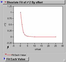
LAPOPDENERR
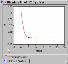
LAJOBDENERR
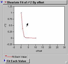
These correlograms have very steep drop off rates as the grids are translated along the x axes. This indicates that there are lots of high frequency spatial variations in the data and could be a sign of poor agreement between model and individual grid. R2 values for these seem lower than what we would like to see if the model was effective in inferring population density from light intensity values.
![]() Visualization
of autocorrelation error:
Visualization
of autocorrelation error:
large magnitude of error with high frequency variation over distance

error grid ____________________________
distance
![]()
Result of this autocorrelation would be lower normalized r-values past the initial one and faster drop off on correlogram.
low magnitude of error low spatial variation
![]()
![]()
error grid _____________________________
distance
![]()
Result of this autocorrelation would be high normalized r-values past the initial one and slower drop off on correlogram. This is what we want to see in our error grids.
It seems to me that we are seeing the first instance and not the situation shown in the second diagram.
Follow on the next page are displays of the error grids and their histograms.
The red areas are
indicative of areas where the model overestimated the population densities; the
blue areas show underestimates. The worst
error is concentrated in the densest downtown area. The model apparently does not work well in
downtown
Which residual error grid has the smallest mean absolute deviation?
I obtained the actual standard deviation by running the SAMPLE function in ArcInfo on the three overages, and then bringing the resulting text table into JMP. There is probably an easier way to do this in ArcView. It is then possible to get the standard deviation and histograms of the error residuals.
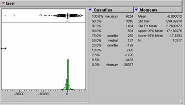
|
Grid |
Standard Deviation |
|
LAERR (model – ambient average) |
890.69218 |
|
LAPOPDENERR (model – lapopdensity) |
1247.1901 |
|
LAJOBDENERR (model – lajobdensity) |
1179.9465 |
The LAERR layer, produced by subtracting the LAAMBIENT cover from the LADENEST population density model has the lowest absolute standard deviation. This makes sense since the LAAMBIENT coverage was used to produce the model.
ANALYSIS OF
We decided
to apply the LA style analysis to the city of
Starting with the Usnightbinary image of the Usatnight we clipped the image to the correct areal city coverage.
Run REGIONGROUP to build polygon coverages with unique number ids.
Produce a mask by running: maskgrid = SETNULL(region_group_output ne 1, 0), you will have to figure out which polygon value belongs to your city. Setnull makes every value not equal to your city value == 0. This gets rid of every light concentration accept the one you specifically need.
Apply the mask to the population density: Albuquerquepd = Albuquerquemask x Uspopden.
Apply the mask to Usatnight: Albuquerquenight = Albuquerquemask x Usatnight
When all these manipulations were
accomplished we had three grids:
Next we ran
the SAMPLE function to produce a text table of xy values with their associated
grid values for the clipped light and population density coverages. This table went into jump and a regression
equation was derived. This equation uses
the light values to estimate the population density values. Running the regression equation on the
Making Sense of Spatial Grids and Time Series Analysis (Trying to see the trees in the forest!) --
Many of the terms used in the analysis of spatial data and time series are similar. In time series analysis we are interested in discriminating against those portions of the composite waveform that are don’t contain useful data and in enhancing those portions of the signal spectrum that do contain meaningful information. The discrimination is done by low- or high-pass filtering operations. These operations can be done either in the time domain or the frequency domain. These two domains are transformations of one another, done by means of Fourier analysis. Fourier analysis lets us decompose a signal into its single frequency components. No attempt seems to be made in improving the quality of spatial data after it is acquired, but in time series analysis no one would ever accept the raw data and use it to make inferences. Is data from the light sensing satellites so clean that it doesn’t need additional work? What could be some of the sources of noise in the light data set? Some of these are reduced because I think that the satellite accumulates lights over time. This acts as a low pass filter and discriminates against random light flashes. This process also reduces the amount of information in the intensity values as things get averaged.
We accept the idea that any naturally occurring time series (e.g., earthquake p waves) is composed of varying amounts of both signal and noise and make a determined effort to build up signal at the expense of noise. The most straightforward technique is to simply filter off noisy components if they are aggregated in a single or narrow frequency band. A high-pass filter keeps the high end of the components and rejects, with varying success, those noisy low frequency components. Similarly, a low-pass filter would attempt to reject high frequency noise. Notch filters try to reject or pass a very narrow frequency band.
Another technique used to remove repetitive information from a signal and improve the signal to noise ratio is spike and predictive deconvolution, special types of correlation.
On the other side of frequency rejection, it is a common exercise to increase the relative proportions of useful data by employing spectral whitening procedures. These can be done in either the time or frequency domains. In spectral whitening, we try to equalize all the frequency components in our zone of interest. In a sense we are trying to get rid of the normal frequency distribution. The high frequency components allow us to make the most precise measurements. They are the most valuable and of course, the hardest to obtain, since high frequency waves are the most easily scattered and are attenuated by the time they get to the sensor. They can be restored however, with some success.
What does this have to do with spatial data or grids? Time series are a two dimensional reference frame in which the components are amplitude and time. In the case of the frequency domain the components are amplitude and frequency. Grids are multidimensional reference frames in which the components are length and width with a third dimension of magnitude. In a sense grids are the same as time series without the directional nature imposed by time. Do we have to do our analyses on histograms? That would be a dead end because we cannot restore the pixels to their correct spatial locations. We could run standard time series operations (that we can visualize) on histograms and then re-transform the resulting values to the grid reference frame. A histogram of a grid is a transform from space to something like a time series (amplitude versus dimensionless distance (?), it doesn’t matter).
In time series analysis we are concerned with the sampling of the signal. The sampling interval of discrete digital values determine the frequency of the data we can collect. This required sampling interval is determined by the Nyquist formula that states that sampling rate must be twice the highest frequency sampled.
Do these concerns have anything to do with spatial datasets? I think they are inherently noisier than we believe. In spatial datasets the sampling unit is the pixel, not the second. Pixel size seems to work just like sampling intervals in time. The larger the pixel size, the less high frequency spatial information we recover. In nighttime lights analyses we are concerned with the size of the blobs, but the big blobs are aggregations of small blobs. The small blobs contain information. Would it be valuable to be able to reconstruct the values of the small blobs and separate their values from the larger aggregations or is the amount of “smear” a function of population density. The pixel size limits the amount of information we can get from the small light variations. There are still high-frequency variations within the big blobs but they may be buried by the more intense light inputs from the bigger light sources. Can a kind of spectral whitening be applied to the big aggregations to restore the high-frequency information? Better resolution and discrimination might mean improved regression models.
What does the (supposed) binary step gain used in the satellite end of the data acquisition process do to the input data? Large values are scaled down and weak values are pumped up. There are threshold limits at both ends of the data. I don’t have a good idea of the raw dynamic range of the nighttime lights signal. At least very high values are reduced to a huge degree. Surely we lose information about light intensity by the gain values filter put on the data by the satellite. What is the range of the output signal, 1 - 256? Is this a valid representation of the actual light intensities? Our models have to take this limitation into account by default. Better, more representative data, might be an easy way to improve the models. To me, it seems that this concern for gain problems is more important than pixel resolution, and more cost effective in terms of processing time.
Questions About Correlation --
Correlation, especially autocorrelation, is an important technique of traditional signal analyses. Cross-correlation is commonly done to recognize similarities between two or more input signals. The result of a cross-correlation between two identical signals (autocorrelation) is a Weiner-Levinson autocorrelation or recognition spike, the width of which is determined by the frequency components of the input signals, assuming that the wavelets are zero-phase (non-skewed or zero skewed). The central peak of an autocorrelogram wavelet is unity. The width of the central output wavelet is relatively unimportant, it being a function of the average of the frequencies in the individual series. What is important is the value or amplitude of the spike. This amplitude corresponds to our R-value. Incidentally, in time series, the convention is to display both sides of the autocorrelation function, not just half of it like we do in our correlograms. We always start at zero-lag and work in just one direction, but there is no reason not to go both ways. (Will the ArcInfo CORRELATION function accept negative x or y values?) We would get a diagram that we are more used to working with. The width (frequency) of the correlogram is wider for data dominated by low frequencies and narrower for high-frequency data. Additional lobes on either side of the central spike are due to repetitive frequencies or “ringing” in the data set. One of the goals of traditional time series analysis is to remove those outer lobes though filtering and signal to noise enhancements such as whitening and deconvolution. These side effects might be seen if we carried out larger translation shifts on our ArcInfo correlations.
Wave Number and Spatial Datasets --
Another way of describing time series is by means of wave number or k. Wave number is the number of waves of a particular length per unit distance. k = number of waves per distance while frequency = number of waves per time. While wave number is not of much use in time series work, it might be a way to link up the ideas of time series analysis to spatial displays. We have gotten around the constraint imposed by the time axis part of the display by replacing it with the spatial unit of distance. Would this scheme help us visualize and apply time series techniques to spatial grids?