John Doe
GEOG 3650 – Spatial Statistics
Lab #3 – Spatial Interpolation: Inverse Distance Weighting and Kriging of Several Datasets including Ozone Concentration
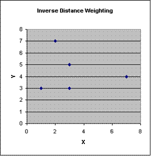
Task #1: Inverse Distance Weighting by Hand
|
x |
y |
Value |
IDW Value |
|
|
|
|
|
|
|
|
1 |
3 |
11 |
|
|
|
|
|
|
|
|
|
3 |
5 |
7 |
|
|
|
|
|
|
|
|
|
2 |
7 |
3 |
|
|
|
|
|
|
|
|
|
3 |
3 |
|
8.427874 |
|
|
|
|
|
|
|
|
7 |
4 |
9 |
|
|
|
|
|
|
|
|
|
|
|
|
|
|
|
|
|
|
|
|
|
|
|
|
|
|
|
|
|
|
|
|
|
|
|
|
|
|
|
|
|
|
|
|
|
|
|
|
|
|
|
|
|
|
|
|
|
|
|
|
|
|
|
|
|
|
|
|
|
|
|
|
|
|
|
|
|
|
|
|
|
|
|
|
|
|
|
Z = |
SUM (Value/distance^2) |
|||
|
|
|
|
|
|
|
|
SUM (1/distance^2) |
|
||
|
|
|
|
|
|
|
|
|
|
|
|
|
|
|
|
|
|
|
|
|
|
|
|
|
|
|
|
|
|
|
|
|
|
|
|
|
|
|
|
|
|
|
|
|
|
|
|
|
|
|
|
|
|
|
|
|
|
|
|
|
|
|
|
|
|
|
|
|
|
|
|
|
|
|
|
|
|
|
|
|
|
|
|
|
|
|
|
|
|
|
|
|
|
|
|
|
|
|
|
|
|
|
|
|
|
|
|
|
|
|
|
|
|
|
|
|
|
|
|
|
|
|
|
|
|
|
|
|
|
|
|
|
|
|
|
|
|
|
|
|
|
|
|
|
|
|
|
|
|
|
|
|
|
|
|
|
|
|
|
|
|
|
|
|
|
|
|
|
|
|
|
|
|
|
|
|
|
|
|
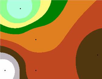
Above is the IDW interpolation done by ArcView with the point included in the analysis (expressed as 8, .dbf conversion didn’t like the 8.4). The calculated point falls in the colored band containing the value of 8.0 supplied by hand.

Above is the IDW interpolation down by ArcView with the point excluded from the analysis. The classification value at the point is between 8.33 and 9.222. The point computed by the IDW algorithm is very close to the value calculated by hand. The IDW interpolation routine in ArcView makes the computation for all the points in a coverage and allows you to contour the interpolated output. The various distance weights may be changed and several outputs compared.
Task #2: Kriging and IDWing Without a ‘Truth’ or Reference Grid
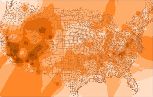
Idwozone
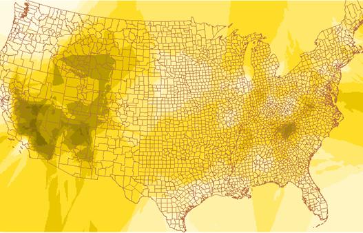
Krigozone
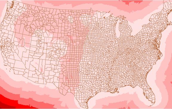
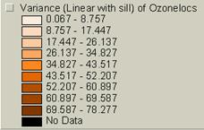
Varozone
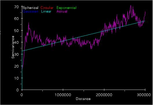
Semivariogram for ozone levels
Discussion of the IDW and Kriging function parameters:
The IDW function we used to produce our idwozone is –
IDW(usozonesites, 03apr2oct_, #, 2, sample, 11, 1000000, 10000)
usozonesites – input point coverage with z values
03apr2oct_ -- field with ozone point percentage values
# -- placeholder when using a point coverage containing point locations
sample – specifies that the nearest (num points) sample points within (max radius) will be used for z value interpolation
2 – power exponent of distance
(num points) --11
(max radius) --1000000 map units
(cell size) -- 10000 , width or height of a cell in map units
The kriging function we used to produce our krigozone is—
KRIGING(usozonesites, 03apr2oct_, #, both, varozone, linear, sample, 11, 1000000, 10000)
uzozonesites – input point coverage with z values
03apr2oct_ -- field with ozone point percentage values
# -- placeholder when using a point coverage containing locations
both – both an INFO file with semi-variance data and a an out_lattice file will be
created
varozone – name for out_lattice file
linear – calls for linear with sill semi-variogram model
sample – specifies that the nearest (num points) sample points within (max radius) will be used for z value interpolation
(num points) --11
(max radius) --1000000
(radius) -- 10000 map units , all points within this radius will be used for interpolation
1) Compare and contrast the appearance of the three grids, idwozone, krigozone, and varozone.
The idwozone seems to draw more circular contours than does the kriging process. The kriging zones are more angular and tend to run in almost linear trends to the north and south. The overall shapes created by the contours are different. The IDW process seems to make the most sense visually, but that may be because we are used to looking at data portrayed in this way. Our eyes and minds seek rational patterns in everything. The varozone is almost completely different from the other two grids. It is forming more or less circular patterns that do not correspond spatially with the idwozone and krigozone displays. The varogram is plotting variances so it should not be an overlay of the krig estimates. Areas where the z values are changing should correspond to varogram increases. It almost like a map of 1st derivative values.
2) Where are the areas of high ‘ozone’ concentration in idwozone and krigozone? Do the two images agree in general?
Overall the areas of highest ozone concentration are similar on the idwozone and krigozone patterns. The nature of the patterns is more circular on the idwozone than they are on the krigozone display. The areas of highest ozone concentration are over Arizona, southern Nevada and California, and northwestern Wyoming Idaho. There is a belt of high concentrations over the Appalachian Region in Virginia, Tennessee, and Kentucky. Overall the two estimates are similar.
3) What is the IDW and Kriged estimate of 03apr2oct_ at the Four Corners location? What is the value of varozone at Four Corners? If the varozone value is the standard error of the kriged ozone estimate, what is your 95% confidence interval for the 03apr2oct_ for Four Corners?
Ozone Estimates in Percentages (?)
|
Idwozone |
Krigozone |
Varozone |
|
38.725 < Est < 43.469 Est. = 41.1 |
Est. = 39.464 (right on color boundary) |
35.61 < Est. < 38.317 Est. = 36.9 |
95% C.I. Estimates
Taking a Varozone value of 36.9 as the standard deviation the 95% C. I. for the krig measurement should be:
(-1.96) * s < Est. < (+1.96 * s )
-72.3 < Est. < +72.3
If this is correct our values fall within the 95 % C. I.
Task #3: Spatial Interpolation With a Known Full Valid Coverage to Validate Estimates Against
The Elevation Dataset
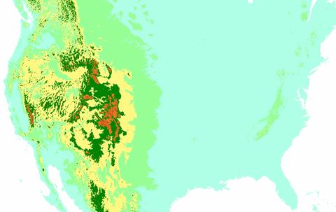
Nademzla - DEM of North America
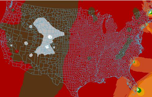
IDW Estimate of Elevations
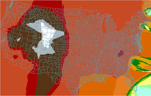
Kriging Estimate of Elevations
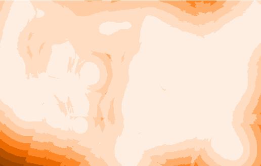
Varogram of Elevations
1A) How well did the IDW or Kriging spatially interpolate elevation?
Both the IDW and the Kriging technique seem to have done a reasonable job in interpolating elevations. Both images seem to match overall. The image that was “kriged” shows more high frequency variations in the elevation patterns.
2A) Does the varelevation grid seem honest with respect to characterizing the error of estimate?
The varelevation grid is a plot of the variance of the spatial points. Although the color scheme is pretty crude it shows the greatest variances over the areas where elevations are changing the fastest. In areas where there is a rapid change in elevation one would expect the variances to reflect this. This seems to be occurring in the varogram.
3A) Create two error grids with simple map algebra.
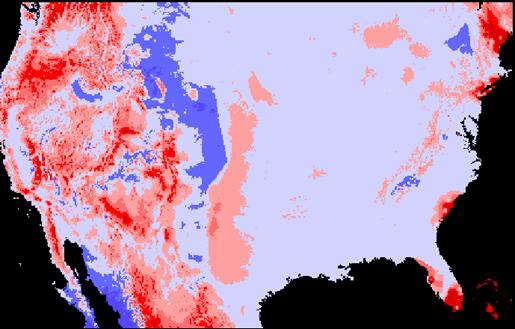
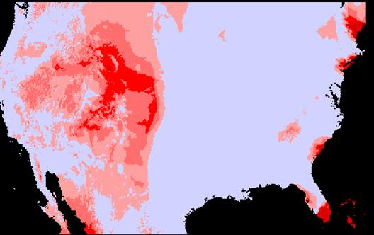
IDW Error Grid (Jidwerr = nademlza – IDW estimate)
Standard Deviation Plot
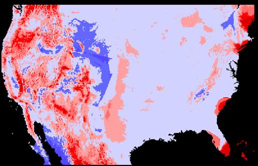
Krig Error Grid (Jkrigerror = nademlza – Krig estimate)
Standard Deviation Plot
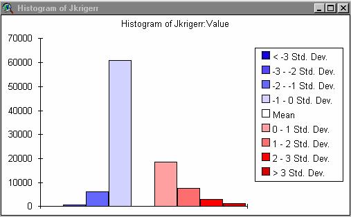
4A) Now create the absolute error (so over and underestimates do not cancel each other out when you calculate the mean).
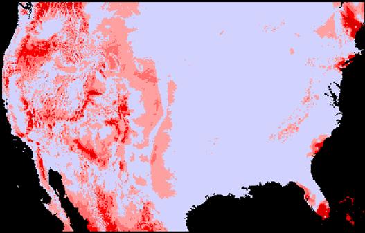
Absjidwerr = ABS(Jidwerr)
Absjkrigerr = ABS(Jkrigerr)
Which interpolator had the lowest mean absolute deviation?
Absjidwerr = 267.3456 (mean) standard deviation = 404.4393
Absjkrigerr = 266.1614 (mean) standard deviation = 371.6063
5A) Comment on the usefulness of IDW and Kriging for interpolating elevation data with point coverages on the density of usozonesites.
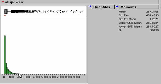
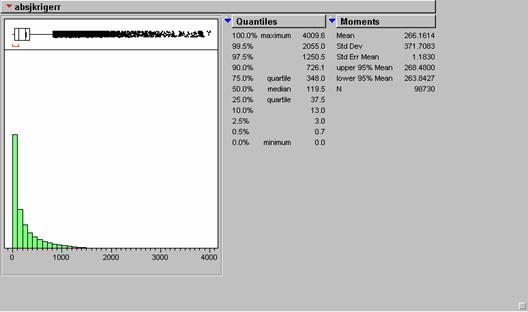
The amount of error in the two methods seems almost identical. The IDW absolute mean error was very slightly larger than the absolute mean of the KRIG error. The IDW error was only about .44% larger than that of the KRIG error. On the displays, it seems that kriging produced higher errors when the elevations values were the largest, i.e., over the Rocky Mountains. There are also larger errors in south Florida. It might have something to do with a decreased density of sampling sites near the seacoast where values suddenly cease.
The Population Dataset
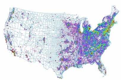
Population Density = Uspopdenpro
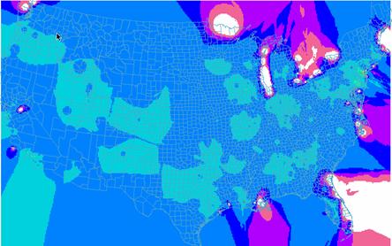
IDW Estimate of Population = johnsidwpop
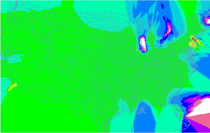
KRIG Estimate of Population = johnskrigpop
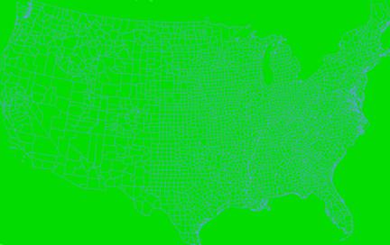
Varogram of Population Krig
1B) How well did the IDW or Kriging spatially interpolate population density?
The IDW seems to have produced a better result visually than the Krig technique. Both images seems to match overall. The image that was “kriged” shows more homogeneity despite being displayed with the same classification scheme. The varogram shows nearly constant variance across the entire U.S.
2B) Does the varpopulation grid seem honest with respect to characterizing the error of estimate?
The varpopulation grid reflects what we see in the density estimate. That is, low amounts of variance overall with local changes in density not being picked up by the variance plots. I have doubts about this interpolation set because population density is not a smoothly varying surface. It contains small spatial concentrations that interpolation programs probably have trouble with at this scale.
3B) Create two error grids with simple map algebra.
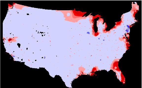
IDW /Population Density Error Grid (johnsidwpoper = uspopdenpro – johnsidwpop)
Standard Deviation Plot
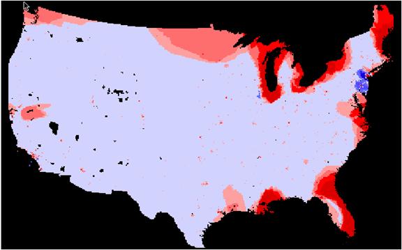
Krig/Population Density Error Grid (johnkrigpper = uspopdenpro – johnskrigpop)
Standard Deviation Plot
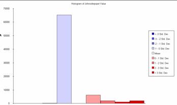
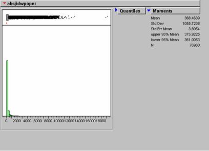
Histogram of johnsidwpoperr
4B) Now create the absolute error (so over and underestimates do not cancel each other out when you calculate the mean).
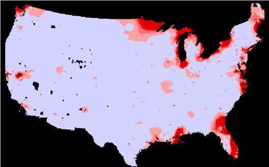
Absjidwpoper = ABS(Johnsidwpoper)
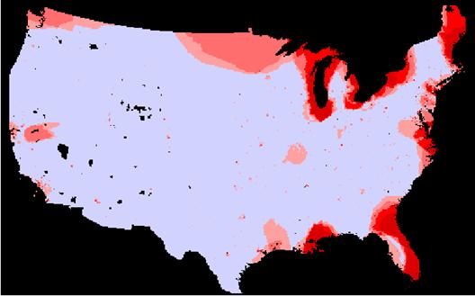
Agsjkrigpper = ABS(johnskrigpper)
Which interpolator had the lowest mean absolute deviation?
Absjidwpoper = 368.4639 (mean) standard deviation = 1055.7238
Absjkrigpper = 446.7092 (mean) standard deviation = 966.9165
5B) Comment on the usefulness of IDW and Kriging for interpolating population data.
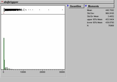
When examined with our error analysis isn’t much visual residual between the original Population Density grid and the estimates by either method. The IDW method produced significantly lower absolute mean error. The KRIG absolute mean error was about 21% greater than that of the IDW estimate. Again it seems that the most error with either method occurs in estimating the more extreme portion of the true range. Perhaps the small high-density concentrations tend to be ‘pulled down’ by the numerous low-density values around them. This seems to happen in the NYC area on the density error grids. I would choose the IDW method over kriging for this exercise. The krig seems to do more smoothing than the IDW and this is not what we want for a population density estimate at this scale.
The Landcover Dataset
The landuse data is not continuously varying like the elevation and population density data. Landuse values are nominal data and do not lend themselves to IDW and KRIGGING techniques which try to reconstruct a smoothly varying trend surface. I think this is why this part of the lab was called ‘inappropriate.’
6) Print the variograms for elevation and population density on a sheet of paper side by side. How do they compare and how can they be interpreted in light of what you know about the spatial variability of population and elevation in the conterminous United States.
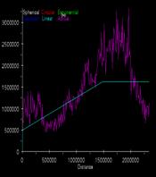
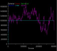
Krig elevation estimate svg Krig population density svg
The elevation data shows fairly strong spatial correlation with low variance at the near offsets and increasing variance as distance increases. This make intuitive sense because elevation should be strongly spatially correlated. I assume that “magic math” runs the autocorrelations in all directions so nothing can be assumed from the offset profiles. I don’t understand why the variances decrease with offset at the right side of the graph unless they are wrapping. The population density shows almost a flat fitted variance indicating randomness. I would expect less spatial correlation for population density than for U.S. elevations but there should be some degree of correlation. It makes sense for the population variance to increase rapidly with distance. The idea of fitting a flat variance estimate to the population curve seems odd. It indicates that the population density distribution is strictly random. I guess this is true when you consider the entire U.S. In local urban areas it is strongly correlated but then drops off quickly with distance.
Task #4: De-trended Kriging of Ozone in Great Smoky Mountains National Park
.
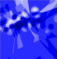
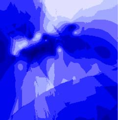
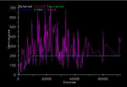
Ozoneloc Krig = johnkrgsnmp Ozoneloc Krig using ArcView
from ArcInfo lag = 5, distance = 10000
|
|
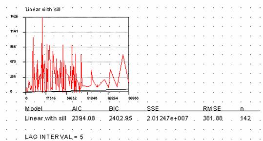
These semivariograms produced with the different GIS platforms look somewhat alike, so it looks that they are doing similar things with the data. The estimate of variance in the ArcView semivariogram is a little lower than that in the ArcInfo plot and the y values don’t agree in the graph. Not sure if this is important.
|
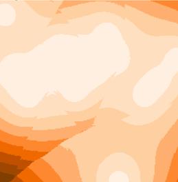
Ozoneloc IDW = johnidwsnmp
|
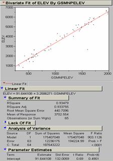
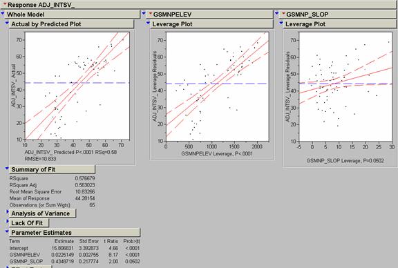
In order to construct a model that predicts ozone concentration (adj_intsv_) from gsmnpelev and gsmnp_slope, I used the Fit Model function in JMP. The results are shown above. An adjusted R2 value of .563023 was the result. The regression model from the fit was adj_intsv_ = 15.806831 + .4348719 (gsmnp_slope) + .0225149 (gsmnpelev).
I ran several models on different combinations of pertinent variables with adj_intsv_ as the dependent variable, some of these models were only univariate but it doesn’t take too much time to try them out with JMP:
|
gsmnpelev |
gsmnp_slope |
gsmnp_land |
adj R2 |
Model # |
|
|
|
X |
.481441 |
1 |
|
X |
X |
X |
.728203 |
2 |
|
X |
X |
|
.563023 |
3 |
|
X |
|
|
.542301 |
4 |
|
|
X |
|
.106812 |
5 |
|
|
X
|
X
|
.50808 |
6 |
|
Model #` |
Model Parameters |
|
1 |
59.067061 – 3.738089 (gsmnp_land) |
|
2 |
27.301059 – 2.03296 (gsmnp_land) + .0187703 (gsnmp_elev) + .4306569 (gsmnp_slope) |
|
3 |
15.806831 + .0225149 (gsmnpelev) + .4348719 (gsmnp_slope) |
|
4 |
17.787131 + .0239096 (gsmnpelev) |
|
5 |
37.098346 + .8859724 (gsmnp_slope) |
|
6 |
53.994561 + .4951384 (gsmnp_slope) – 3.526363 (gsmnp_land ) |
I also tried latitude and longitude. Forget about it! Of all these, model #2, incorporating all three land variables, has the highest adjusted R2 value, but there was some question about the nature of the land cover variables so I chose not to use it. Instead I chose model # 3 which utilizes gsmnpelev and gsmnp_slope. The next step is to apply this new model to the ozonelocs coverage and see how it compares with the simple krig on the adj_intsv_ values. The new model would be more useful than the krig of the ozone values because one could perhaps extend it to areas where there are no ozone monitoring sites, but this would be a stretch. It would be great to be able to predict ozone concentration directly from elevation, slope, and land cover alone, but ozone concentrations in one localized area may have completely different causes than in other areas (e.g., urban vs. forested zones).
Ozone Model #3
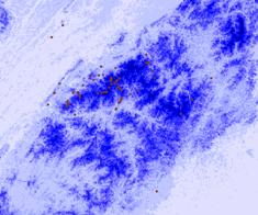
We then compared the errors of the generated model #3 with the actual values of the ozonelocs point coverage. This was done by a summarize zones command between the ozonelocs point cover and the computed ozone model above. The values derived from multivariate regression were subtracted from the adj_intsv_ values that represented ‘truth.’ The resulting sums, placed in an ‘error’ field, were negative where the model overestimated ozone and positive where the model underestimated. These errors were then kriged to produce an interpolated error surface.
Residual Error Statistics
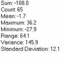
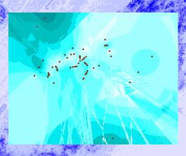
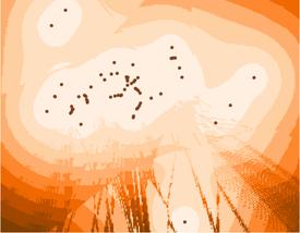
Krig of Residual Errors Krig Error Varogram
|
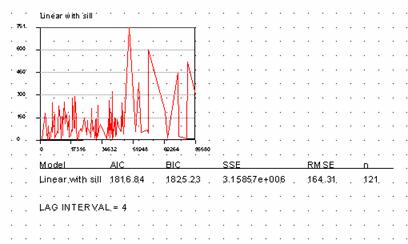
Following this the krig error surface was added to the Ozone Model #3 surface to correct for the over and underestimates of the original regression. This procedure is called de-trended kriging. It serves merely to correct errors left over from regression inference of ozone based on elevation and slope.
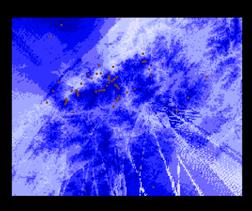
Model #3 Estimate + Krig Error Surface
1) How do these models compare visually?
All three models are reasonably similar in appearance, once one gets accustomed to looking at krig surfaces.
2) How could you quantitatively compare the accuracy of these interpolations?
The model estimate looks a lot like the elevation surface it was generated from. I was surprised at the high amount of covariance provided by the gsnmp slope factor when we looked at the curve fits. I don’t understand what slope has to do with ozone concentration; it seems as if elevation should play a bigger role. There may be a false correlation effect in here. It might not be slope but slope’s effect on something like temperature that is affecting ozone levels.
To quantitatively measure the accuracy of the estimates, we could click around on the grids and look at the interpolated values and compare them with the point measurements. Another way would be to use the Sample function in ArcInfo and generate an x, y list of values for the measured data points, the krig and idw estimates, and the model and corrected model estimates. You could compare the means, standard deviations, and variances and then throw out the worst methods. One would have to accept the measured point values as ‘truth’ and compare the various estimates to these values where they are densest and most reliable. Kriging should work well with these values because they are probably strongly spatially correlated and the sampling sites are fairly numerous and close together.
Last Exercise:
Use JMP to general x, y, and z random variables consisting of 300 records. Create shapefile of points to convert to point coverage. Krig these points and attach printout of variogram and interpret.
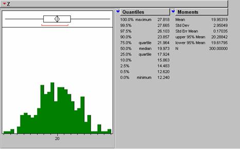
Z Normal Distribution (Created by 20 + Random Normal () * 3)
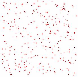
300 Random X, Y, and Z (Classified) Dots
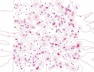
“Meaningless” Contours Created Using IDW Weighting
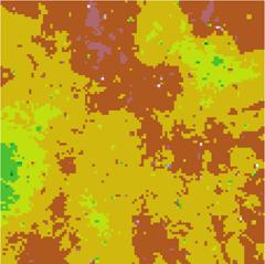
Krig Interpolation of Random Normal Z Distribution
Linear With Sill, Fixed, Search Distance 4, Sample Count 12
|
|
|
|
|
|
|
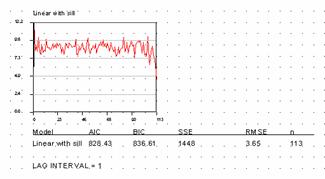
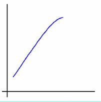
Semivariograms are plots of variance between points versus increasing distance. It is a way of seeing how much less similar points are that is far away than points are that are close together. In this example the variance approximates a straight horizontal line. This tells us that there is no difference in variance between points that are close together and those that are far away. Normally points close to one another are more similar than points that are distant. In this case the semivariogram might look like this:
|
Our dataset is not a naturally occurring one. It is made of totally random points generated by JMP. There should be no spatial correlation between the z values whatsoever. That’s why the variance line remains flat with distance. The line in our plot does not go through 0 variance. Again, there is no natural progression of spatial correlation from near to far. It just starts out at a specific value picked by the random number generator and stays there. The distance from 0 variance to the line is called the nugget variance. On our plot it has an initial value of 828.43. That is about 100 * (standard deviation)2 of our input dataset. The range for our dataset is essentially = 0 since the variance is flat from the start. In terms I can try to understand (no magic math) the estimate of the z value is == Z + nugget variance. In normal data sets (see the ozonelocs ArcInfo semivariogram above) there will be an estimated variance fitted through the variogram scatter. This estimate will be the values assigned to the points at their respective offsets.
Kriging is designed to interpolate through more or less natural datasets that have spatial correlation. It does not do well with values that are random in space and magnitude. IDW interpolations are also meaningless in this situation. Contouring operations assume that a slope is going somewhere. If the values have no trend or ‘structure’ the contours are misleading, patterns are being created where none exist.
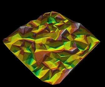
300 Random Dots Surface
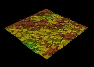
Surface of Krig Random Z Point Grid
Linear With Sill, Fixed, Search Distance 4, Sample Count 12
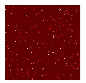
Variance of a Spatially Random Distribution
These diagrams were made using ArcView and Marco Boeringa’s Kriging Interpolator for 3D Analyst. It is difficult to relate the parameters in the ArcView kriging routine with those used in the ArcInfo function. One would like to be using the same parameters on both platforms so we aren’t comparing apples and oranges when we evaluate outputs.
