Jane Doe
GEOG3560
Lab Exercise #3
May 21, 2001
Task #1: Inverse Distance Weighting by Hand
|
X coord |
Y coord |
Value |
|
1 |
3 |
11 |
|
3 |
5 |
7 |
|
2 |
7 |
3 |
|
3 |
3 |
8.4 |
|
7 |
4 |
9 |
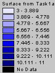
Since I couldn’t convert the shapefile of my event theme into a coverage, I used the IDW surface feature in ArcView to create the new surface. ArcView’s IDW function, using a power of 2, calculated a value of 8.396667 for the z value at coordinates 3, 3. It was able to complete the calculations for cells over the entire surface in just a few seconds, while it took me several minutes to do just a single calculation. The surface generated using the IDW surface option in ArcView is shown below.

IDW Approximation of Point Data Set
Task #2: Kriging and IDWing Without a ‘Truth’ or Reference Grid
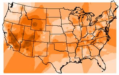
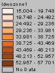
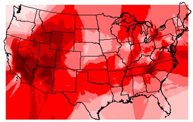
The output grids generated when interpolating the ozone surfaces using IDW and Kriging are shown below.
IDW Estimate of Ozone
Kriged Estimate of Ozone
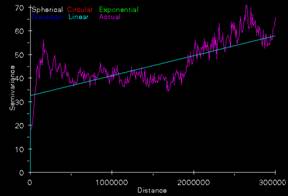
Semivariogram used to Krig Ozone Surface
Variance of Kriged Ozone Estimate
1. The highs and lows on the IDW grid are characterized by circular patterns similar to bull’s eyes around points. This is inherent in the IDW method, where the ozone values are multiplied by a 1/d2 factor, causing the interpolated ozone values to drop off rather quickly.
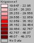
Instead of circular patterns, the patterns in the Kriged grid appear to have blockier shape. These blocky areas also seem to cover more space than the corresponding IDW areas. This may be due Kriging’s attempt to fit a smoothed surface to the point values. The Kriged surface would change more gradually than the IDW surface.
Both the IDW and Kriged grids come up with some strange and bizarre patterns around the edges of the map. That would be important to remember when interpolating surfaces, and you should try and use points extending beyond your area of interest to avoid the weird edge effects.
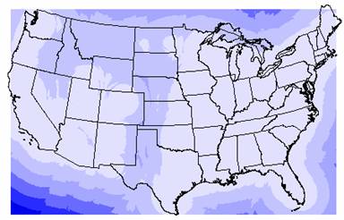
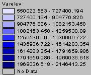
The variance grid appears to increase in a pattern similar to wave fronts that extend away from the U.S. borders. There are also two areas of higher variance within the U.S. One band runs north to south from North Dakota through eastern Texas to the Mexican border. Another area of higher variance extends west from western North Dakota, through Montana, northern Wyoming, western Idaho, eastern Washington and Oregon down into northern Nevada. These areas of higher variability in the data can be explained by looking at the variance plot superimposed with the sites of the ozone locations. (See grid diagram below) The 1035 ozone sites are not evenly distributed throughout the U.S., they are concentrated in the eastern U.S. and along the west coast, leaving the Great Plains states and western states poorly represented. The fewer points there are, the greater the distance between points and the less autocorrelation there would be when interpolating the ozone values, hence there is more variability among these points and you would have less confidence in the interpolated values.
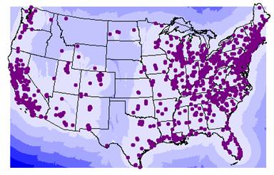
Ozone Variance with Point Locations
2. Although the IDW grid and Kriging grid were generated using very different techniques, these grids agree fairly well, with areas of high and low ozone levels occurring in approximately the same locations. There are three main areas with high ozone levels. The first covers many western states including southern Montana, Wyoming, southern Idaho, western Colorado, Utah, New Mexico, Nevada and California. Another band of high ozone levels runs east to west through northern Texas, Oklahoma, Tennessee, North Carolina, and Virginia. The last band of high ozone levels runs north to south from Tennessee through western Kentucky, Indiana and then flares out to cover portions of Wisconsin and Michigan. To check and see how closely the two methods, IDW and Kriging agree, I subtracted the two surfaces, the resulting grid is shown below.
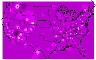
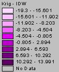
Difference between the Kriged Surface and the IDW Surface
You can see that the majority of the map is in close agreement, with the difference between the two grids falling between –0.805 and 2.894. In the bull’s eyes the IDW values are greater than the Kriged values, again demonstrating the tendency of Kriging to try and fit a smoother surface than IDW.
The values on both surfaces fall within the range of the original ozone values (14 to 58.) The IDW surface values range from 15 to 58 and the Kriged surface values range from 19 to 49, but you still don’t really know which method is doing a better job at approximating the ozone levels across the U.S.
3. At Four Corners, the values on the three grids are: IDW=41.88, Krig=41.30 and Varozone=37.12. Using the varozone value as the standard error of the estimate, a 95% confidence interval for the Kriged ozone estimate at Four Corners would be, -31.40 to 102.76. This interval covers a range more than 3 times the original data value. The Four Corners location occurs in the western U.S., where the ozone site density is low. As mentioned before, the fewer points there are, the greater the distance between points and the less autocorrelation there would be when interpolating the ozone values. So there is more variability among these points and you would have less confidence in the interpolated values.
Task #3: Spatial Interpolation with a Known Full Valid Coverage to Validate Estimates Against
1a. The IDW and Kriged
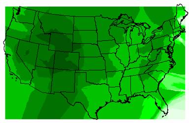
estimates of Elevation are shown below.
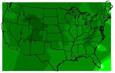
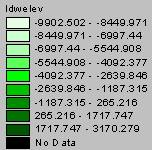
IDW Interpolation of Elevation
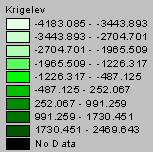
Kriged Interpolation of Elevation
To assess how well the IDW and Kriged surfaces estimated elevation, I compared them to the original DEM, shown below.
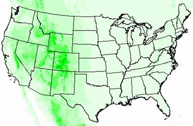
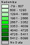
DEM of the United States
The original elevation values from the DEM ranged from –79 to 6098. The IDW elevation values range from –9902 to 3170 and the Kriged elevation values range from –4183 to 2470. The extreme negative values occur along the edges of the U.S. and so can be attributed to edge effects, but still both of the interpolation methods drastically underestimate elevation highs. The Rocky Mountains and the Appalachians appear on both grids, but not in a good approximation of their locations and extents, and the Cascade Range and the Sierra Nevadas are totally missing. Part of this can be explained by the ozone point coverage. As shown in Task #2 of this exercise, there were only 1065 ozone sites across the nation and they were not evenly distributed. If none of these sites were in areas of high elevation, then it is no wonder that the elevation interpolations are so much lower than the DEM elevations. Also, you can not model a surface as complex as elevation across the entire U.S. using only 1065 points, not with very accurate results anyway.
2a. The grid of the variance for the Kriged elevation interpolation is shown below.
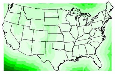
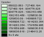
Variance of Kriged Elevation Estimate
The variations in the Kriged elevation estimates are enormous. The smallest variance (550023) is 22 times the largest elevation estimate, which indicates that there is so much variation in the data that these values are really closer to a guess than an actual interpolation. As mentioned earlier in question 1, a variable as complex as elevation is not a good candidate for surface interpolation, not with only 1065 points covering the entire U.S.
The pattern in the variance grid is very similar to the one shown in the ozone variance, with the variance increasing in wavefronts away from the borders of the U.S. and bands of higher variance across the Great Plains states and over portions of the western states. The variance appears to be related more to the placement of points rather than the data at the point values. As mentioned in task #2, the fewer points there are, the more distance between points, so there is less autocorrelation when trying to interpolate the values. This results in more variability among these points, and so you would have less confidence in the interpolated values.
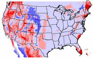
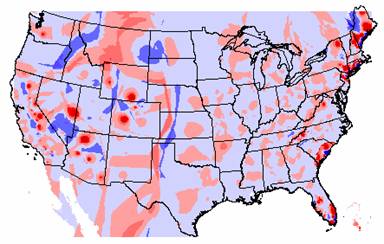
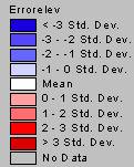
3a. The error grids
for both the IDW and Kriged interpolations are shown
below. 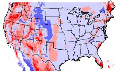
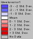
IDW Elevation Error
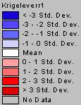
Kriged Elevation Error
The elevation errors for the IDW and Kriged interpolations are quite similar. The blue areas show where the interpolations have overestimated the elevation and the areas underestimated by the interpolations are shown in red. Much of the eastern U.S. and the mid-west are overestimated by the interpolation methods. This could be because the interpolated elevation values were pulled up to try and reach the elevation highs in the Rocky Mountains. Conversely, much of the western U.S. is underestimated. Possibly, these values are lower since the methods try to interpolate a surface through the values near sea level along the coastline, effectively pulling these values down.
To get a more accurate picture of how the IDW and Kriged interpolations differ, I subtracted the grids, and the grid of Krig – IDW is shown below.
Difference Between Krig and IDW Elevation Surfaces
This grid diagram shows that the two methods really agree remarkably well. The vast majority of the U.S. shows the difference between the interpolated elevation values to be within ± 1 standard deviation.
4a. The mean absolute deviations for the IDW and Kriged elevation surfaces are:
IDW(elevation) = 267.346
Krig(elevation) = 266.161
Kriging gave the lowest mean absolute deviation. Typically, the interpolater with the lowest mean absolute deviation could be an indicator of which method calculated the best estimate for the surface. But, these values are actually so very close, within just one point, that no real difference in the interpolators can be discerned from these values for the mean absolute deviation.
5a. Elevation can be a very complex variable, and can change drastically even within a small area. Because of this extreme variability it is not a good candidate for spatial interpolation. For this data set, the point coverage contained only 1065 ozone sites across the nation and they were not evenly distributed. The number and placement of these points had a great impact on the results of the interpolations. Without adequate representation of elevation values you can not expect the interpolated surfaces to be very accurate. There are other reasons why elevation is not a good candidate for this type of interpolation. The general population is very familiar with elevation measurements, and they expect elevations to be reported with a relatively high degree of accuracy. Also, quality elevation data is readily available for most areas. There may be applications where this interpolated elevation data would be adequate, but why use it when better quality data is almost always available.
1b. The IDW and Kriged estimates of population density are shown below. 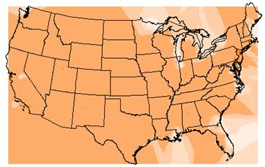
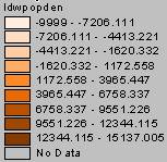
IDW Interpolation of Population Density
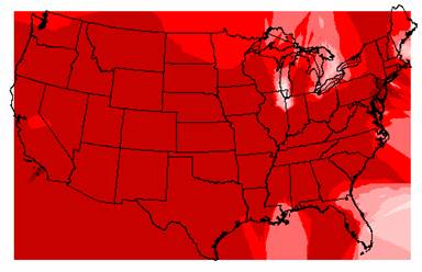
Kriged Interpolation of Population Density
To assess how well the IDW and Kriged estimated population density, I compared them to the grid for population density in the U.S., shown below.
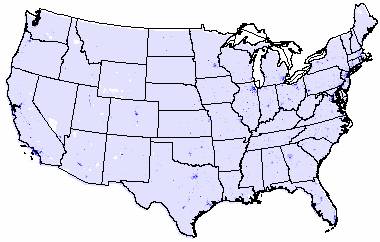
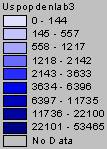
Population Density Grid for the United States
The original population density data ranges from 0 to 53,465. The IDW interpolation ranged from –9999 to 15,137 and the Kriged interpolation ranged from –9999 to 6130. The negative population densities reported by both interpolation methods are not possible, but looking at the grids, these negative values are located primarily near the boundaries of the U.S. map, near the Great Lakes and near Lake Tahoe in California. So, the invalid negative values can be accounted for at least partially by edge effects. Looking at the valid positive values, both interpolation methods underestimate the high range of population density. That could be a result of point placement, if none of the ozone sites were close to a large city, these high end population density values could have been missed. And since the ozone sites were located near National Park Sites that seems like a very reasonable explanation for the low population density estimates. Again the number and placement of the point coverage plays an important role in the interpolation results.
2b. The variance grid for the Kriged population density estimate is shown below.
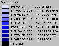
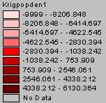
Variance of Kriged Population Density Estimate
The variations in the Kriged estimates are even larger for population density than they were for elevation. The smallest variance (13317542) is over 200 times the largest population density estimate. Again, you really can’t have a lot of confidence in the interpolated values when the variance is so enormous. From the previous lab, the majority of population density values across the U.S. are small, with only a few large cities reporting high densities. Maybe there would be a way to force the interpolation to assign positive numbers or zero to the population density estimates, since negative densities do not make any sense. Alternatively, those areas less than zero, could be reclassified to a zero value, which at least would be a better approximation of the actual population densities. Again the biggest limitation in the interpolations is the number and placement of the ozone site locations. Interpolating a surface for the entire U.S using just 1065 points is not conducive to accurate results, no matter which variable is being estimated
There is very little pattern in the variance grid at all. The entire nation is covered with the lowest range of variance from 10896171 to 11165212. I tried unsuccessfully to get ArcView to display the variance grid using a natural breaks classification. That may have shown more character in the variance, and I’m not sure what this grid of ‘constant’ variance could mean.
3b. The error grids for both the IDW and Kriged interpolations are shown below
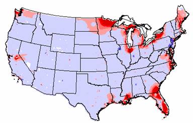
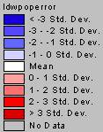
IDW Population Density Error
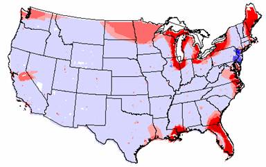

Kriged Population Density Error
Again, the errors between the actual population density and the interpolated surfaces for IDW and Kriging are remarkable similar. All the extreme values are along the borders of the U.S, with the highest underestimations of the population density values occurring in Florida, Maine, along the Great Lakes, and in portions of Louisiana and Mississippi. In the vast majority of the country, the interpolators overestimated the population density value, but only by –1 standard deviation.
To get a more accurate picture of how the IDW and Kriged interpolations differ, I subtracted the grids, and the grid of Krig – IDW is shown below.
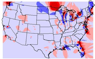
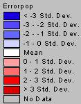
Again, this grid shows that the two methods really agree remarkably well. The vast majority of the U.S. shows that the difference between the interpolated elevation values is within ± 1 standard deviation. The extreme values occur along the U.S. border and could be due to edge effects.
4b. The mean absolute deviations for the IDW and Kriged population density surfaces are:
IDW(elevation) = 231.176
Krig(elevation) = 446.709
The IDW grid has the lowest mean absolute deviation, indicating that it may be the better interpolation method for this data set.
5b. Population density is another variable that may be problematic to interpolate. The distribution of population density across the U.S. was described in a previous lab, with most of the country covered by low population density values with just a few medium sized towns and even fewer large cities. The quality of any spatial interpolation rests with the number and placement of the point coverage. If a point didn’t land near or in one of the large cities, then that increase in population density would be lost in the resulting interpolated surface. Similarly if the small towns were underrepresented, then the population density for the majority of the country would be overestimated. I do think that population density is more suitable for spatial interpolation than elevation. A surface of population density would show less variation and more continuity than and elevation surface and so you could get a more accurate estimate by interpolating population density. Though, you would probably need many more data points than the 1065 that were used in the exercise to get a more reasonable representation of U.S. population density.
1c – 5c. It is inappropriate to interpolate a surface for landcover since the grid contains categorical data. Only continuous data can effectively be interpolated over surfaces. For example, if the landcover data set defines 4 as forest and 5 as desert a value of 5.5 does not indicate that the area is half forest and half desert. There is no valid interpolation between these numbers since they represent individual categories of land cover type.
6. The semivariograms used in Kriging the elevation and population density data sets are shown below.
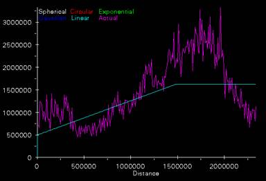
Elevation Semivariogram
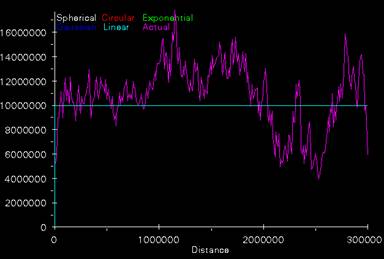
Population Density Semivariogram
The semivariogram for the Kriging of the elevation values has a nugget of about 500,000 and a sill of about 1,600,000 occurs at a distance of about 1,500,000. Using a linear function to characterize this curve may not be the best choice. Maybe a more complicated function, possibly a gaussian function, could be used to better describe this relationship between variance and distance. Or this pattern in the variogram could indicate that stationarity, one of the main assumptions of Kriging, is not true for this data set. Stationarity assumes that the autocorrelation function remains constant throughout the data set.
The semivariogram for the Kriging of the population density is really just a flat line at a nugget of 10,000,000. As with the elevation semivariogram, this simple linear function doesn’t really do a good job of describing the semivariogram curve seen in the plot. A flat line indicates randomness, but there does seem to be some pattern in the curve. The semivariogram appears to increase slowly until a distance of about 1,750,000 and then the curve takes a downward trend followed by an upward trend. As with the elevation semivariogram, maybe a more complicated function should be used to approximate this curve. Or, the assumption of stationarity is not being met and kriging is not an appropriate method to use to interpolate this data set.
Task #4: De-Trended Kriging of Ozone in Great Smoky Mountain National Park
The relationship between the two elevation variables, elev and gsmnpelev can be analyzed usng a linear regression. As you can see in the scatterplot below, there is a very strong relationship between the two elevation measurements although they are not exactly the same. I have consistently used the Gsmnpelev variable to represent elevation throughout the steps in Task#4.
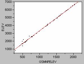 Scatterplot of Elev vs.Gsmnpelev
The regression line defined by the regression is:
Elev = 96.042 + 3.23Gsmnpelev ; R2 = 0.996 and the p value <0.0001
The simple IDW and Kriged estimates of ozone in the Great Smoky Mountain National Park are shown below.
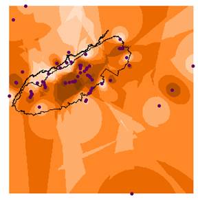
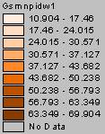
IDW Estimate of Ozone
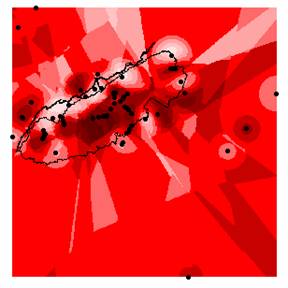
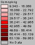
Kriged Estimate of Ozone
The semivariogram used in the Krig calculations is shown below.
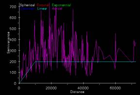
Ozone Semivariogram
The variables of elevation (gsmnpelev), slope (gsmnpslope) and land cover (gsmnpland) were used to generate a more accurate multivariate model to estimate ozone values. First, the contribution of each variable was examined univariately. The simple regression between ozone and each of the variables of interest resulted in the following regression equations.
Ozone = 13.63 + 0.027Gsmnpelev ; R2 = 0.69 ; p value<0.0001
Ozone = 37.10 + 0.886Gsmnpslope ; R2 = 0.69 ; p value<0.0001
Ozone = 59.07 – 3.74Gsmnpland R2 = 0.49 ; p value<0.0001
I decided to omit the land cover variable in the ozone model. Since it is nominal data, the regression isn’t really a valid representation of the relationship between ozone and land cover. You would have to re-run the analysis using a dummy variables to do an appropriate analysis. A model was created to estimate ozone using just the elevation and slope variables. The scatterplot for the model is shown below.
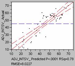 Scatterplot of Ozone
Model
The regression equation for the model is:
Ozone = 10.642 + 0.026Gsmnpelev + 0.514Gsmpslope ; R2 = 0.72 ; p value<0.0001
This regression model explains 72% of the variation in ozone levels and should provide a more accurate estimate of ozone than just the simple IDW or Kriged interpolations. A grid of the ozone estimate for the model is shown below.
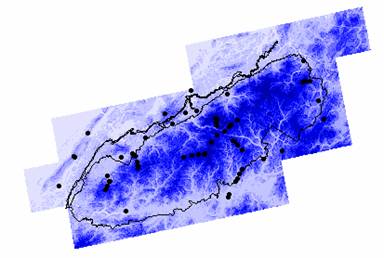
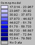
GSMNP Ozone Model
An adjusted model was created by taking the error between the original ozone values and the regression model values, then kriging the error values to generate an error surface, and then finally adding the kriged errors back to the regression model. The grid of the adjusted model is shown below.
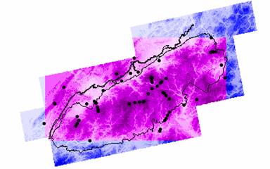
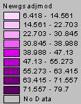
Adjusted Model of Ozone
This adjusted model has been truncated from the original model because of the shape of the kriged the error surface. The points outside the park did not have elevation data, and so there were no modeled values or error measurement for these locations. Those points were excluded from the kriging when the error surface was interpolated, hence the kriged errors do not cover the entire park area. The kriged error surface and the error semivariogram are shown below.
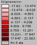
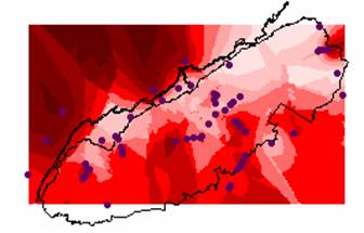
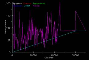 Kriged Ozone Error
and Error Semivariogram
1. The three models, the simple IDW, simple Kriged and the regression model are quite different visually. There is a depth and detail to the Model and the adjusted Model grids that is not present on either of the two interpolated grids. As far as the data ranges, the original ozone values range from 10.0 to 70.1, the IDW values ranged from 10.9 to 69.9, the Kriged values from 9.3 to 69.9 and the adjusted model values ranged from 6.4 to 79.7.
The simple interpolations assume that ozone is totally independent of any other variable and that spatial autocorrelation provides the best estimate of its value. This is not the case with ozone or probably the majority of other variables. Usually, the best method for generating a surface of values is to first provide an estimate based on what is known about that variable. In this case the estimate was generated using a regression analysis with the slope and elevation values. Then, you can improve that estimate by calculating the errors between the original values and the model, create an error surface, and then add that back to model. This creates a final adjusted model that uses all the available information about your dependent variable and hopefully provides a more accurate picture of what may be going on.
2. To quantitatively compare the accuracy of the interpolations you could perform a cross validation analysis. In the cross validation process a set of points is kept out of the interpolation and modeling processes. Then after the surface estimates are generated, they are compared to the values at those excluded points. The surface with values closest to these points will give the best estimate of the variable. The errors are compared by looking at the smallest mean absolute error, this takes into account the level of error in both the positive and negative directions.
Task# 5: Last Exercise
The semivariogram used to krig the random variable is shown below.
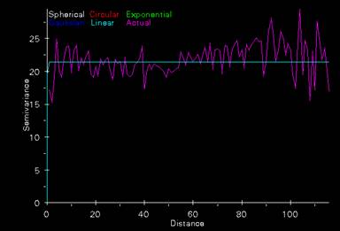
Random Point Semivariogram
This semivariogram has a nugget of 20, the mean of the data set of normally distributed random points. The sill is 21, this is where the variance no longer changes and occurs at a distance of approximately 1. So, once you move one unit away in distance the variance becomes constant. This makes sense since this data is randomly located and randomly assigned a z value, so there is no autocorrelation present. The variance just bobs back and forth, above and below the sill value generating the flat line shown in the semivariogram plot shown above.